Kern Your Enthusiasm (3)
By:
August 3, 2014
One of 25 installments in a series of posts analyzing and celebrating a few of our favorite (and least favorite) typefaces.
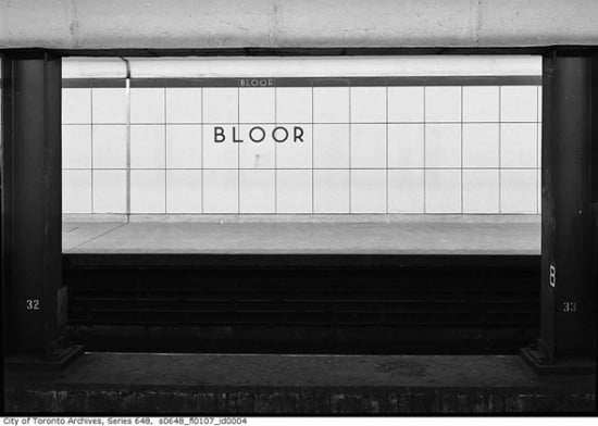
TORONTO SUBWAY | UNKNOWN | c. 1954
The first time I visited Toronto as an adult, I nearly swooned on a subway ride — I’d never had such a visceral response to typography before.
The Toronto subway opened in 1954, and the original stations used a unique typeface: a geometric sans serif that included only upper-case letters, ten numerals, an ampersand, period, apostrophe, and an arrow. As Joe Clark relays in his history of Toronto transit signage and typography, the original font has a few distinguishing features:
- Near-perfect circles for C, G, O, and Q.
- Similarity of upper and lower bowls of B.
- Near symmetry of E and F along a horizontal midline.
- An X that looks like a multiplication sign (clearly an incorrect form).
- A Futura-like S made of two hooks.
- Strokes that tend toward straight lines (even the stem of the distinctive low-waist R) and terminate at right angles.
- Spiky corners on M, N, V, and W that descend below the baseline or project above the cap height.
Toronto Subway has some similarities to, among other typefaces, Gill Sans — which has been used, at times, on signage throughout the Toronto system. In fact, in the 1990s, when the Toronto Transit Commission hired eminent Canadian designer Paul Arthur to revise the entire signage system, he proposed replacing the original typeface — and all the variations used since — with Gill Sans. Thankfully, this change was never made. Despite the TTC’s lack of attention to its own typography, the original Toronto Subway typeface has not gone unnoticed. Histories like Clark’s have been written, Jose Ongpin created dense typographic history illustrations, Spacing magazine created a popular set of buttons and magnets, and typographer David Vereschagin created an electronic version — not without some controversy.
Toronto’s original 1954 stations display a consistent, tactile materiality. Their aesthetic has been repeatedly described as “Canadian washroom,” because tile (referred to as “Vitrolite” in Clark’s history) dominates. The station names were sandblasted into wall tiles, across the borders between the tiles. The names were painted a contrasting color to the tile color, creating an effect that Clark calls “subtly three-dimensional,” and which he says “gives a feeling of permanence.” The original directional signage used the same typeface and employed white characters on black steel (both enameled and not) and backlit plastic signs. In the 1950s and 1960s, occasional directional signboards also appeared with painted-on type, which — according to archival photos — appear to have reversed the colors (to black on white). These materials were mostly, although not consistently, kept in use throughout the expansion of the subway system.
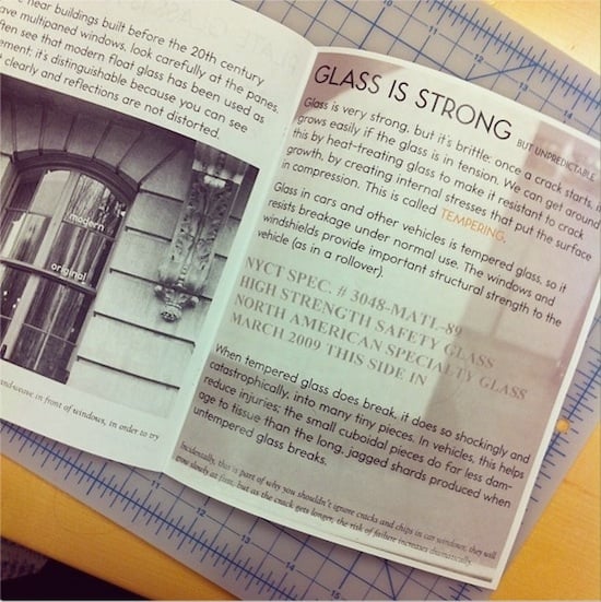
My favorite use of the electronic version of Toronto Subway is in a zine series called Material Evidence, created by Toronto native, engineer, professor, materials scientist, and HiLobrow contributor Deb Chachra. Appropriate for the makeup of the tiles upon which this typeface was originally used, the first issue of Material Evidence concentrated on glass.
The designer of the Toronto Subway font has never been identified.
2012: KIRK YOUR ENTHUSIASM (Captain Kirk scenes): Dafna Pleban: Justice or vengeance? | Mark Kingwell : Kirk teaches his drill thrall to kiss | Nick Abadzis: “KHAAAAAN!” | Stephen Burt: “No kill I” | Greg Rowland: Kirk browbeats NOMAD | Zack Handlen: Kirk’s eulogy for Spock| Peggy Nelson: The joke is on Kirk | Kevin Church: Kirk vs. Decker | Enrique Ramirez: Good Kirk vs. Evil Kirk | Adam McGovern: Captain Camelot | Flourish Klink: Koon-ut-kal-if-fee | David Smay: Federation exceptionalism | Amanda LaPergola: Wizard fight | Steve Schneider: A million things you can’t have | Joshua Glenn: Debating in a vacuum | Kelly Jean Fitzsimmons: Klingon diplomacy | Trav S.D.: “We… the PEOPLE” | Matthew Battles: Brinksmanship on the brink | Annie Nocenti: Captain Smirk | Ian W. Hill: Sisko meets Kirk | Gabby Nicasio: Noninterference policy | Peter Bebergal: Kirk’s countdown | Matt Glaser: Kirk’s ghost | Joe Alterio: Watching Kirk vs. Gorn | Annalee Newitz: How Spock wins
2011: KIRB YOUR ENTHUSIASM (Jack Kirby panels): Douglas Rushkoff on THE ETERNALS | John Hilgart on BLACK MAGIC | Gary Panter on DEMON | Dan Nadel on OMAC | Deb Chachra on CAPTAIN AMERICA | Mark Frauenfelder on KAMANDI | Jason Grote on MACHINE MAN | Ben Greenman on SANDMAN | Annie Nocenti on THE X-MEN | Greg Rowland on THE FANTASTIC FOUR | Joshua Glenn on TALES TO ASTONISH | Lynn Peril on YOUNG LOVE | Jim Shepard on STRANGE TALES | David Smay on MISTER MIRACLE | Joe Alterio on BLACK PANTHER | Sean Howe on THOR | Mark Newgarden on JIMMY OLSEN | Dean Haspiel on DEVIL DINOSAUR | Matthew Specktor on THE AVENGERS | Terese Svoboda on TALES OF SUSPENSE | Matthew Wells on THE NEW GODS | Toni Schlesinger on REAL CLUE | Josh Kramer on THE FOREVER PEOPLE | Glen David Gold on JOURNEY INTO MYSTERY | Douglas Wolk on 2001: A SPACE ODYSSEY | MORE EXEGETICAL COMMENTARIES: Joshua Glenn on Kirby’s Radium Age Sci-Fi Influences | Chris Lanier on Kirby vs. Kubrick | Scott Edelman recalls when the FF walked among us | Adam McGovern is haunted by a panel from THE NEW GODS | Matt Seneca studies the sensuality of Kirby’s women | Btoom! Rob Steibel settles the Jack Kirby vs. Stan Lee question | Galactus Lives! Rob Steibel analyzes a single Kirby panel in six posts | Danny Fingeroth figgers out The Thing | Adam McGovern on four decades (so far) of Kirby’s “Fourth World” mythos | Jack Kirby: Anti-Fascist Pipe Smoker