Galactus Lives! Kirby Close-Up (4)
By:
March 4, 2013
Fourth in a six-part series of posts.
Phase Three: The Inks
I don’t have the original artwork for this page, so I took the published image and made it black and white; I’ll discuss color tomorrow.
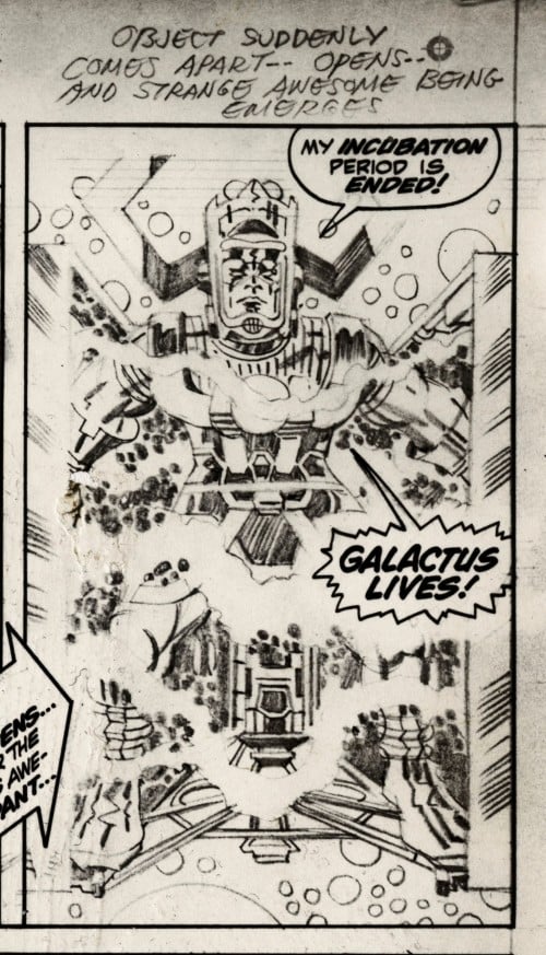
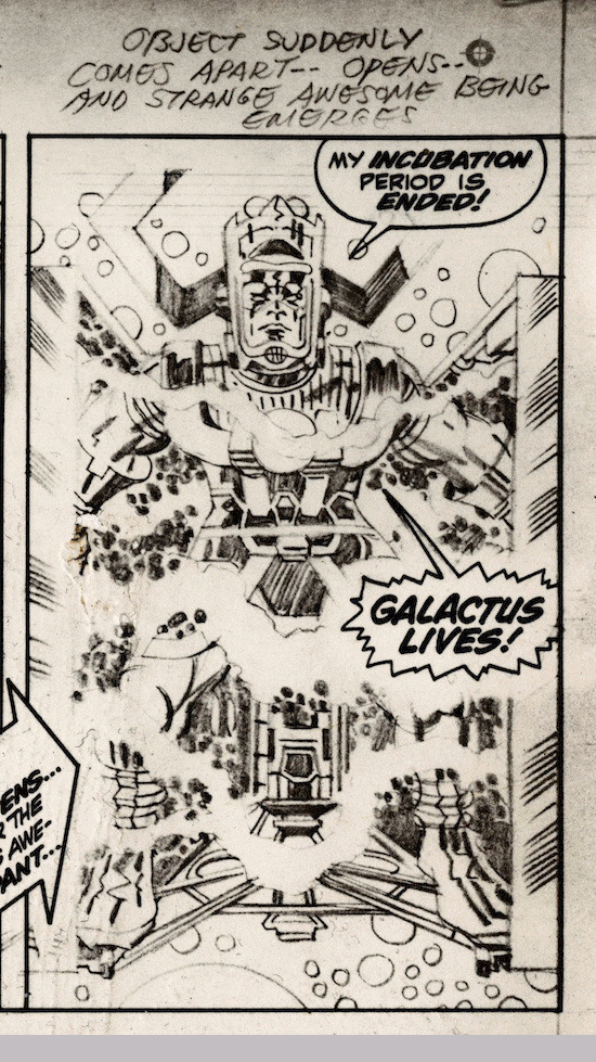
Much has been written about Vince Colletta’s inking, most of it not so good. However, when I looked at the published page of Thor #162, page 17, and compared it to Kirby’s pencils, I initially gave Colletta an “A” for his inking. There are no missing figures, there are no major crimes of omission; Vinnie did his job here – he added inks to this page so that it was suitable for publication.
But when I enlarged panel 2 for a posting at Kirby Dynamics and took a much closer look at that Galactus image, I was amazed by how much more dynamic Kirby’s penciled image is than the published version. I felt like I was looking at a new Kirby illustration for the first time. The closer I looked at the penciled drawing, the more I realized… Vinnie sucked the energy out of that panel.
To show you an animated comparison of the two images, I made this little clip:
Watching the moment of transition where the images dissolve into one another really gives you an idea of how much more electric Kirby’s composition was than the final inked version.
Let’s zoom in and take a look at the two panels side-by-side starting with the top third of the image:
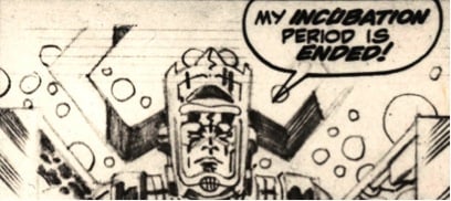
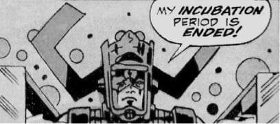
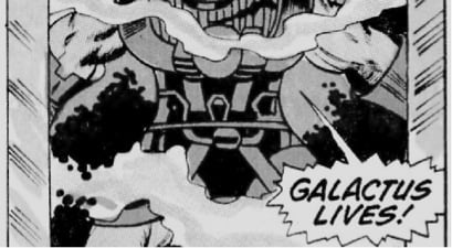
Colletta does a nice job using a template to make perfect circles but notice he makes a few of the planets black dots, and he doesn’t really delineate Kirby’s circles; instead, he adds his own plus some smaller black dots. Looking at Galactus’s face, Colletta doesn’t add the shadow under the nose, or the cheekbone on the left side of the face, or the black areas over Galactus’s eyes that make him look angry in Kirby’s pencils. Plus, Colletta makes the eyes a little smaller. All of these decisions sanitizes (Colletta-izes?) the image. Also notice that — over Galactus’s right shoulder — Colletta obscures Kirby’s crackle with all black.
Middle third:
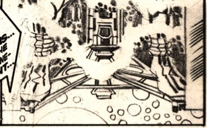
Colletta does a nice job delineating the sections colored purple on Galactus’s costume accurately, but he fumbles the ball on Kirby’s crackle. Aside from some hints of it under Galactus’s arms, Colletta covers the inside of the cube in all-black. But Kirby drew crackle under Galactus’s arms, so Colletta is ignoring Kirby’s decisions here; worse, he’s making up his own Colleta-crackle.
One final thing: You can see Colletta chooses to ink Galactus’s arms and legs as flesh (using thin penstrokes); the colorist picks up on this and uses flesh-tone for the colors. I guess this is Galactus’s summer gear — short sleeves and shorts. Not a major screw-up, but still another reason why Colletta’s delineation of Kirby’s original composition lacks dynamism.
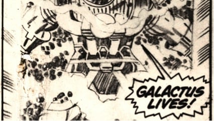
Finally, let’s look at the bottom third of the panel:
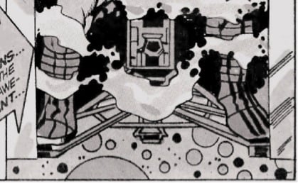
Nice job on that machinery; the boots look good, too. But again, the crackle in the cube is gone, and Colletta has added a few random polka dots to the smoke in areas where Kirby did not draw them. (This could have also been done in the Marvel offices if Lee noticed Colletta had obscured Kirby’s crackle – a few dots added by someone in the bullpen could hint at the original effect Kirby was shooting for.) Colletta inks a few of Kirby’s planets, then he adds some large black dots and several little black dots. These are all nitpicks, but these changes lessen the impact of Kirby’s original composition.
In Colletta’s defense, he did his job; he delineated Kirby’s composition to the point where it’s ready to be published. No one could expect Colletta to spend an hour inking that panel; I bet he knocked that image out in 15 minutes. And many people enjoy Colletta’s inking; Thor was a very popular book in the 1960s. Still, even though I do not think it affects the story, and I doubt anyone felt anything was wrong with this image when they read the comic book as a kid in the ’60s, Colletta has changed Kirby’s image. Instead of Galactus emerging from a cube charged with classic late-1960s swirling, cosmic Kirby energy, Galactus is emerging from a black cube with a few puffs of smoke floating in front of him.
Here is another animation, without the dissolve:
ALSO by Rob Steibel: BTOOM! Kirby vs. Lee
KIRB YOUR ENTHUSIASM POSTS: Jack Kirby as HiLo Hero by David Smay | Douglas Rushkoff on THE ETERNALS | John Hilgart on BLACK MAGIC | Gary Panter on DEMON | Dan Nadel on OMAC | Deb Chachra on CAPTAIN AMERICA | Mark Frauenfelder on KAMANDI | Jason Grote on MACHINE MAN | Ben Greenman on SANDMAN | Annie Nocenti on THE X-MEN | Greg Rowland on THE FANTASTIC FOUR | Joshua Glenn on TALES TO ASTONISH | Lynn Peril on YOUNG LOVE | Jim Shepard on STRANGE TALES | David Smay on MISTER MIRACLE | Joe Alterio on BLACK PANTHER | Sean Howe on THOR | Mark Newgarden on JIMMY OLSEN | Dean Haspiel on DEVIL DINOSAUR | Matthew Specktor on THE AVENGERS | Terese Svoboda on TALES OF SUSPENSE | Matthew Wells on THE NEW GODS | Toni Schlesinger on REAL CLUE | Josh Kramer on THE FOREVER PEOPLE | Glen David Gold on JOURNEY INTO MYSTERY | Douglas Wolk on 2001: A SPACE ODYSSEY | MORE EXEGETICAL COMMENTARIES: Joshua Glenn on Kirby’s Radium Age Sci-Fi Influences | Chris Lanier on Kirby vs. Kubrick | Scott Edelman recalls when the FF walked among us | Adam McGovern is haunted by a panel from THE NEW GODS | Matt Seneca studies the sensuality of Kirby’s women | Btoom! Rob Steibel settles the Jack Kirby vs. Stan Lee question | Galactus Lives! Rob Steibel analyzes a single Kirby panel in six posts | Danny Fingeroth figgers out The Thing | Adam McGovern on four decades (so far) of Kirby’s “Fourth World” mythos | Jack Kirby: Anti-Fascist Pipe Smoker | Adam McGovern on four decades (so far) of Kirby’s “Fourth World” mythos | Jack Kirby: Anti-Fascist Pipe Smoker