LOGOLOGY (5)
By:
May 7, 2025
An installment in a 10-part series that will feature selected excerpts from Josh Glenn’s 2024 contribution — a top-of-mind, semiotics-adjacent analysis of fast food and cannabis brand logos and pack design — to issue no. 1 of the marketing-culture zine Cash & Carry.
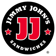
There’s a certain sportiness — make that, sportsiness — to Jimmy John’s logo (updated in 2000). It seems like it was generated (we wouldn’t say “designed”) by one of those services that crank out middle-school sports teams’ branded merch, often at the last minute, for fundraisers. The varsity-letter typography is a giveaway; so are the extraneous stars inserted into the design.
In fact, the letter “J” here has been so drastically foreshortened that “JJ” looks like “11” — might this be an homage to Isiah Thomas, Walt Frazier, Yao Ming? Oh wait, we’ve got it: Julio Jones.
MORE FURSHLUGGINER THEORIES BY JOSH GLENN: SCHEMATIZING | IN CAHOOTS | JOSH’S MIDJOURNEY | POPSZTÁR SAMIZDAT | VIRUS VIGILANTE | TAKING THE MICKEY | WE ARE IRON MAN | AND WE LIVED BENEATH THE WAVES | IS IT A CHAMBER POT? | I’D LIKE TO FORCE THE WORLD TO SING | THE ARGONAUT FOLLY | THE PERFECT FLANEUR | THE TWENTIETH DAY OF JANUARY | THE REAL THING | THE YHWH VIRUS | THE SWEETEST HANGOVER | THE ORIGINAL STOOGE | BACK TO UTOPIA | FAKE AUTHENTICITY | CAMP, KITSCH & CHEESE | THE UNCLE HYPOTHESIS | MEET THE SEMIONAUTS | THE ABDUCTIVE METHOD | ORIGIN OF THE POGO | THE BLACK IRON PRISON | BLUE KRISHMA | BIG MAL LIVES | SCHMOOZITSU | YOU DOWN WITH VCP? | CALVIN PEEING MEME | DANIEL CLOWES: AGAINST GROOVY | DEBATING IN A VACUUM | PLUPERFECT PDA | SHOCKING BLOCKING.