LOGOLOGY (6)
By:
May 14, 2025
An installment in a 10-part series that will feature selected excerpts from Josh Glenn’s 2024 contribution — a top-of-mind, semiotics-adjacent analysis of fast food and cannabis brand logos and pack design — to issue no. 1 of the marketing-culture zine Cash & Carry.
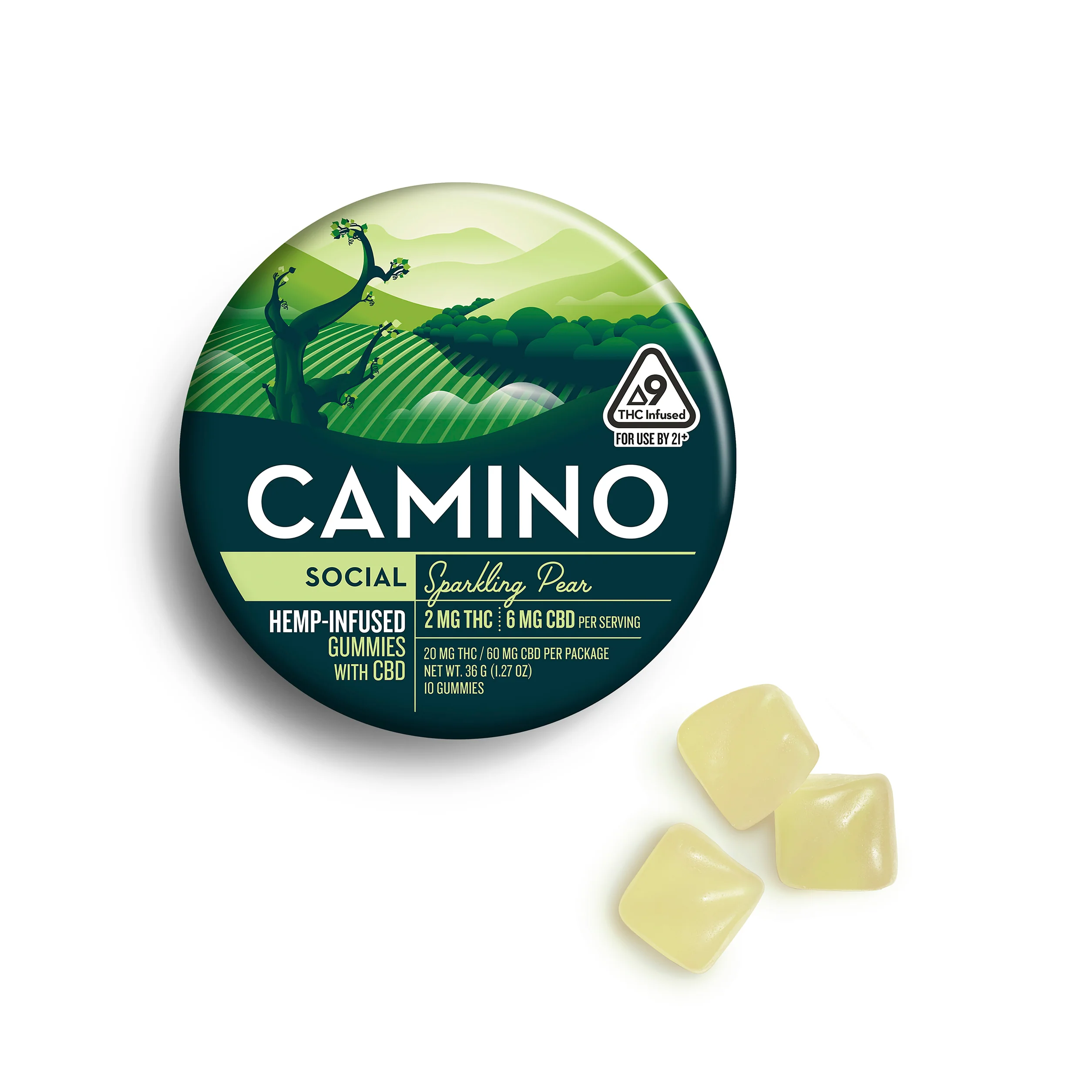
Camino’s use of a sharp, well-balanced, Bauhaus-inspired geometric sans typeface tells you everything you need to know about this brand. It’s about precision, precision, precision. You know exactly what you’ll get out of each edible, leaving you very much in control of the experience.
The packaging illustration is retro, but not in a wacky way — they keep it tight.
MORE FURSHLUGGINER THEORIES BY JOSH GLENN: SCHEMATIZING | IN CAHOOTS | JOSH’S MIDJOURNEY | POPSZTÁR SAMIZDAT | VIRUS VIGILANTE | TAKING THE MICKEY | WE ARE IRON MAN | AND WE LIVED BENEATH THE WAVES | IS IT A CHAMBER POT? | I’D LIKE TO FORCE THE WORLD TO SING | THE ARGONAUT FOLLY | THE PERFECT FLANEUR | THE TWENTIETH DAY OF JANUARY | THE REAL THING | THE YHWH VIRUS | THE SWEETEST HANGOVER | THE ORIGINAL STOOGE | BACK TO UTOPIA | FAKE AUTHENTICITY | CAMP, KITSCH & CHEESE | THE UNCLE HYPOTHESIS | MEET THE SEMIONAUTS | THE ABDUCTIVE METHOD | ORIGIN OF THE POGO | THE BLACK IRON PRISON | BLUE KRISHMA | BIG MAL LIVES | SCHMOOZITSU | YOU DOWN WITH VCP? | CALVIN PEEING MEME | DANIEL CLOWES: AGAINST GROOVY | DEBATING IN A VACUUM | PLUPERFECT PDA | SHOCKING BLOCKING.