LOGOLOGY (8)
By:
June 9, 2025
An installment in a 10-part series that will feature selected excerpts from Josh Glenn’s 2024 contribution — a top-of-mind, semiotics-adjacent analysis of fast food and cannabis brand logos and pack design — to issue no. 1 of the marketing-culture zine Cash & Carry.
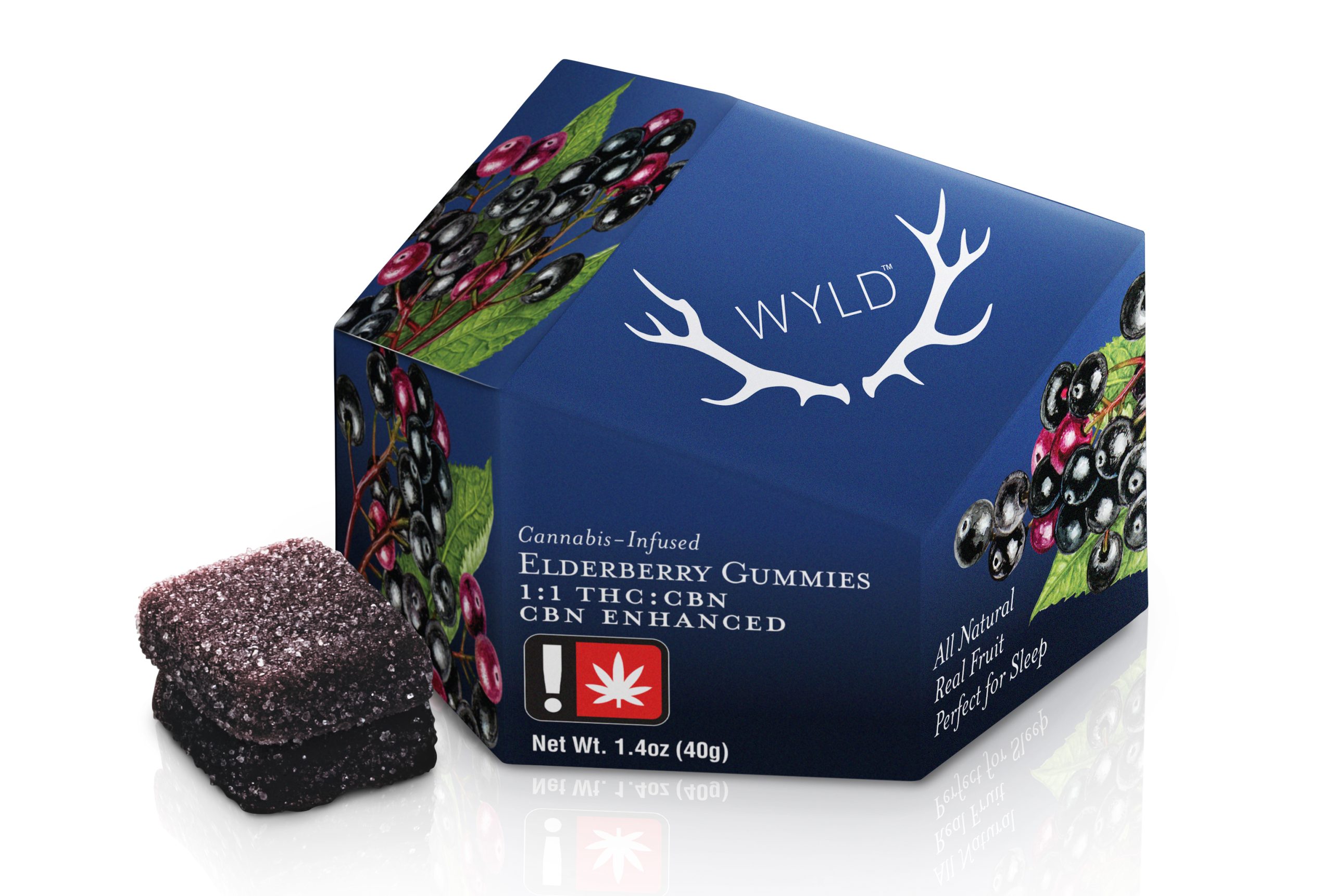
Wyld — with its Edwardian-wallpaper illustration style, real fruit ingredients, use of white space, and strikingly unusual pack architecture is aspirational and elegant. One wouldn’t associate this product with mindless munching or getting stoned out of your mind… it’s about enhancement.
The only thing that doesn’t jibe with this powerful effect is the logo and brand name; although the deliberately archaic spelling does add to the Edwardian vibe. What’s “wyld” about this product?
MORE FURSHLUGGINER THEORIES BY JOSH GLENN: SCHEMATIZING | IN CAHOOTS | JOSH’S MIDJOURNEY | POPSZTÁR SAMIZDAT | VIRUS VIGILANTE | TAKING THE MICKEY | WE ARE IRON MAN | AND WE LIVED BENEATH THE WAVES | IS IT A CHAMBER POT? | I’D LIKE TO FORCE THE WORLD TO SING | THE ARGONAUT FOLLY | THE PERFECT FLANEUR | THE TWENTIETH DAY OF JANUARY | THE REAL THING | THE YHWH VIRUS | THE SWEETEST HANGOVER | THE ORIGINAL STOOGE | BACK TO UTOPIA | FAKE AUTHENTICITY | CAMP, KITSCH & CHEESE | THE UNCLE HYPOTHESIS | MEET THE SEMIONAUTS | THE ABDUCTIVE METHOD | ORIGIN OF THE POGO | THE BLACK IRON PRISON | BLUE KRISHMA | BIG MAL LIVES | SCHMOOZITSU | YOU DOWN WITH VCP? | CALVIN PEEING MEME | DANIEL CLOWES: AGAINST GROOVY | DEBATING IN A VACUUM | PLUPERFECT PDA | SHOCKING BLOCKING.