False Machine (5)
By:
June 29, 2015
The following post originally appeared at Patrick Stuart’s blog False Machine. It is one in a series of 10 analyzing the mini (miniature figure, used in wargames) and other small-scale fantasy and sci-fi models as an art form.
Viewed from the outside, a star-ship, in visual fiction, is like the costume or mask for an entire culture. That is, it must represent that culture at a glance — and as well as that, do all the work of a dynamic moving object. It communicates about itself via proportions, the space it holds, its parts, and the way these all work together.
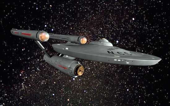
We all know that the Enterprise — the star-ship from the Star Trek franchise — is cool-looking. But why is that so?
At some level, the Enterprise reminds us of a human form.
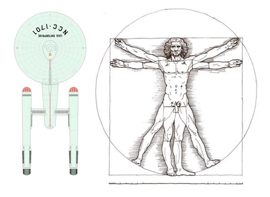
If you compare the Enterprise to a person, and imagine it standing on end, the nacelles would be spindly ‘legs,’ the hull a waspish thorax, and the dish would be centred about in the middle of the breastbone. A human head would poke out of the top. The saucer edges would be where spread-out arms would be, and the reach of those arms is roughly suggested by the edge of the saucer.
The Enterprise has a ‘head’, body and ‘legs’ and those parts are roughly arranged in thirds, which matches the basic structure of life that we are most familiar with. A long thing, arranged into thirds, with a top, middle and end of roughly equal mass, about three times as long as it is wide. When we want to make something look alien or ‘wrong’, we often alter these proportions.
So while the Enterprise is not proportioned like a person, exactly, its proportions are related to those of a person’s; there is a kind of conservation of proportion.
The Enterprise takes up space, but also encompasses space. It is not simply ‘there’, embedding itself into the space like a pile or a block, a planet or a knife. It locks into space in a complex way, like a piece of a puzzle.
In the empty space highlighted by the limbs of the real Enterprise, there are two ‘negative space’ Enterprises that we can imagine.
The first ‘negative space’ Enterprise is upside down and back to front. You could actually almost built two Enterprises locked together, facing top to tail, each upside down relative to the other, with each having its hull trapped in the other Enterprise‘s space, the saucer of each Enterprise opposite the other’s nacelles.
Opposed, locked together so that they could never actually move, facing top to tail and each upside down relative to the other. The shape capable of locking into its negative image is a rare form in sculpture.
The second ‘negative space’ Enterprise is that space encompassed by the ship itself. Above the hull, between the saucer and the nacelles. A weird little puzzle-box back-garden space. You could almost fit another ship in there, if its neck was long it could face back with its neck between the nacelles and if it had wide bits, they could poke out on either side above the hull. It couldn’t be too ‘high’ or ‘deep’, there isn’t room for it.
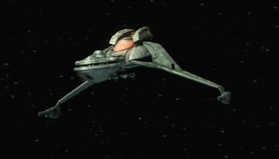
In fact the invisible ship you imagine when you try to think of one to fill that negative space is pretty much the shape of a small Klingon Bird of Prey. Which kind of suggests that the Bird Of Prey is going to somehow mate with or fit into the Enterprise, to fill its negative space. This codes the chief enemy ship in the series as somehow ‘male’ and the Enterprise as ‘female’.
NECK: The neck of the Enterprise is swept forward. This gives it ‘intentness’. It looks eager. The nacelles are swept back, like strange wings; the swept-backness gives them the impression of speed. If the Enterprise were a person it would be one with their head straining forwards and limbs or legs set back and bent, like a sprinter about to launch or someone throwing a javelin.
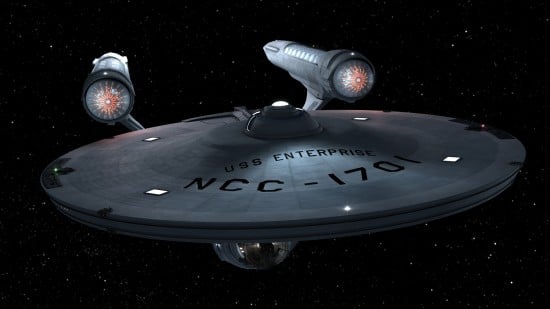
HEAD: On the other hand, the Enterprise has a circular head. The circle is a shape of harmonious order, safe and watchful. It’s probably the least threatening shape we have. Maybe an oval would be even less threatening — but we kind of get that with the Enterprise-D. A bird of prey with a peaceful, ordered and calm head — the Enterprise summons up the intentness and will to action of a bird of prey, but replaces its claws and beak with calm. This contrast is a compelling one.
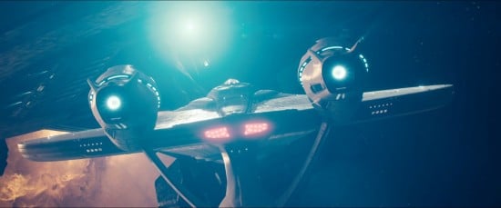
EYE: The Enterprise has an eye of sorts. (The original sensor dish doesn’t glow — which means it doesn’t really fit the idea of an eye as well as later versions.) It’s a friendly watchful eye. One of the good bits of the second Abrams movie is when they meet the ‘bad’ Federation ship it also has an ‘eye’. When violence threatens, that eye half-closes, which is an excellent piece of storytelling.
ENGINES: The engines seem to make the Enterprise go. [Anyone familiar with Star Trek logic will know that the nacelles do not actually ‘push’ the ship. Nevertheless I think it is reasonable to speak of the immediately apprehended sensory impression, the intuition on seeing the ship for the first time, before anything about it is known and perhaps persisting in the subconscious long after that.] The parts connecting them to the hull, and the hull to the saucer are clearly absorbing the imagined ‘force’ of its movement, but they are very slim and very clean. So we imagine them absorbing a large amount of force without difficulty. This reminds us of kinds of engineering we respect and admire. Like when we see a modern bridge, very clean and simple and light, but clearly doing what an old stone heavy bridge did, it makes us feel better about our culture. It speaks of intelligence and calm capacity.
The opposite would be the pyramids, or a 40K imperial star ship. They are all about having a lot of mass. They do not say ‘we deal with our inner powers cleverly and subtlety’ but just ‘we have a shitload of inner power’.
The engines are also placed away from the hull of the ship as a deliberate choice by the designer to indicate the strength and danger of the power they emanate in use.
Almost every part of the Enterprise has both curves and straight lines. The curves are almost always regular and geometrical — nothing organic. The original engines are cylinders, the hull is a cylinder, the dish is a dish. The edges of the hull and nacelles are straight, the dish tents a little up and down. All the lines are stable, not bunched like muscles — more like naval architecture, indicating solidity, regularity.
The ship is an exercise in harmonious contrast. The form says ‘I am going to go fast, to go forward, I am aware and eager and watchful, I am like a friendly, fast, living thing’. But the lines say ‘I am calm, constructed, I am solid, predictable, I will not break, I am never irregular’.
The engines speak of power and the slim and even nature of the limbs speaks of the graceful handling of power.
The proportions of the ship’s mass are almost human, but their arrangement in three dimensional space is more abstract.
When we look at the Enterprise, all of these factors tells us a story about the ship’s character. A story told via form.
CURATED SERIES at HILOBROW: UNBORED CANON by Josh Glenn | CARPE PHALLUM by Patrick Cates | MS. K by Heather Kasunick | HERE BE MONSTERS by Mister Reusch | DOWNTOWNE by Bradley Peterson | #FX by Michael Lewy | PINNED PANELS by Zack Smith | TANK UP by Tony Leone | OUTBOUND TO MONTEVIDEO by Mimi Lipson | TAKING LIBERTIES by Douglas Wolk | STERANKOISMS by Douglas Wolk | MARVEL vs. MUSEUM by Douglas Wolk | NEVER BEGIN TO SING by Damon Krukowski | WTC WTF by Douglas Wolk | COOLING OFF THE COMMOTION by Chenjerai Kumanyika | THAT’S GREAT MARVEL by Douglas Wolk | LAWS OF THE UNIVERSE by Chris Spurgeon | IMAGINARY FRIENDS by Alexandra Molotkow | UNFLOWN by Jacob Covey | ADEQUATED by Franklin Bruno | QUALITY JOE by Joe Alterio | CHICKEN LIT by Lisa Jane Persky | PINAKOTHEK by Luc Sante | ALL MY STARS by Joanne McNeil | BIGFOOT ISLAND by Michael Lewy | NOT OF THIS EARTH by Michael Lewy | ANIMAL MAGNETISM by Colin Dickey | KEEPERS by Steph Burt | AMERICA OBSCURA by Andrew Hultkrans | HEATHCLIFF, FOR WHY? by Brandi Brown | DAILY DRUMPF by Rick Pinchera | BEDROOM AIRPORT by “Parson Edwards” | INTO THE VOID by Charlie Jane Anders | WE REABSORB & ENLIVEN by Matthew Battles | BRAINIAC by Joshua Glenn | COMICALLY VINTAGE by Comically Vintage | BLDGBLOG by Geoff Manaugh | WINDS OF MAGIC by James Parker | MUSEUM OF FEMORIBILIA by Lynn Peril | ROBOTS + MONSTERS by Joe Alterio | MONSTOBER by Rick Pinchera | POP WITH A SHOTGUN by Devin McKinney | FEEDBACK by Joshua Glenn | 4CP FTW by John Hilgart | ANNOTATED GIF by Kerry Callen | FANCHILD by Adam McGovern | BOOKFUTURISM by James Bridle | NOMADBROW by Erik Davis | SCREEN TIME by Jacob Mikanowski | FALSE MACHINE by Patrick Stuart | 12 DAYS OF SIGNIFICANCE | 12 MORE DAYS OF SIGNIFICANCE | 12 DAYS OF SIGNIFICANCE (AGAIN) | ANOTHER 12 DAYS OF SIGNIFICANCE | UNBORED MANIFESTO by Joshua Glenn and Elizabeth Foy Larsen | H IS FOR HOBO by Joshua Glenn | 4CP FRIDAY by guest curators