Blow Up Your Comics (17)

By: John Hilgart
May 13, 2012

Seventeenth in a series of thirty posts by John Hilgart. HiLobrow yields to no one in our admiration for his spelunkery into the mysterious and gorgeous depths of comics that we grew up reading without ever noticing what he’s shown us. Check out the manifesto and FAQ of Hilgart’s 4CP project.
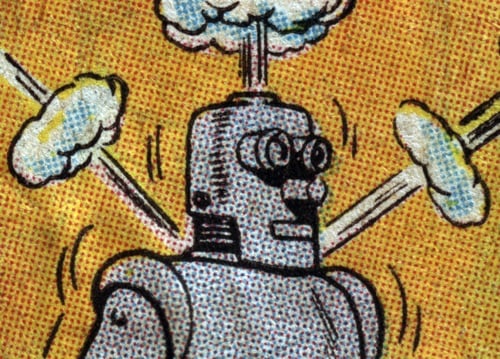
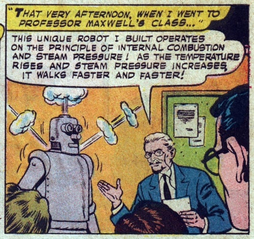
Steam Robot

Click on image for larger version

*

Click on image for larger version

CREDITS: Superman #183, 1966. Art by Kurt Schaffenberger.

***

SIMILAR HILOBROW SERIES: SUBSUPERMEN — Golden Age heroes who didn’t make the grade | MASKED MAN | LIMERICKANIA | MEET THE L.I.S. — John Hilgart discovers “implicit superheroes” concealed within comic-book mastheads | 4CP FRIDAY — themed comic-book detail galleries, curated by admirers of John Hilgart’s 4CP project | KIRB YOUR ENTHUSIASM — 25 writers on 25 Jack Kirby panels | ANNOTATED GIF — Kerry Callen brings comic book covers to life | CHESS MATCH — a gallery of pulp fiction chess games | COMICALLY VINTAGE — that’s-what-she-said vintage comic panels | DC — THE NEW 52 — an 11-year-old reviews DC’s new lineup | FILE X — a one-of-a-kind gallery of “X” pulp paperback covers | SECRET PANEL — Silver Age comics’ double entendres | SKRULLICISM — they lurk among us

CLICK HERE for more comics and cartoon-related posts on HiLobrow.

What do you think?

  1. Neat to click over to the super-large view of the robot and realize that its metallic grey sheen is red and blue dots.

  2. That’s the great event horizon in the process – the point at which your eye can no longer trick you into perceiving blends. Grays are often really good when enlarged, and diverse, given the different ways they’re accomplished.

    This one is 25% R, 25% C, which happen to be aligned in that particular way that tricks the eye into seeing little circle patterns.

    Compare to this crazy pattern:
    http://4cp.posterous.com/292

    Or this gray, which contains Y as well:
    http://4cp.posterous.com/65-0

    A future “Blow Up Your Comics” will have the source for this one, which is a very dark, drab gray at original printed size:
    http://4cp.posterous.com/34-248

  3. Regarding color values, for any given period/printer there were a limited number of options for the percentages of coverage that were available (25%, 50%, etc.). That’s what accounts for various dot sizes or grid patterns (for higher values). I just eyeball them when I make a guess. There seems to have been a way to manage distribution too, so that different colored dots didn’t end up in exactly the same place on the page, entirely overlapping. However, variations in that distribution pattern often yield the coolest results, producing still or vibrating effects when zoomed, as well as creating actual blends (e.g. true green).

Comments are closed.