
DIAGRAMMATIC SUBLIME
By:
August 30, 2026
An installment in EMANATIONS, a series of posts featuring 10 of Josh Glenn’s favorite examples of Radium Age-era fine art that explore a particular proto-sf-adjacent theme. In this case, that theme is DISENCHANTMENT / UNSEEN FORCES. The sub-theme, meanwhile, is…
NETWORK OF STOPPAGES
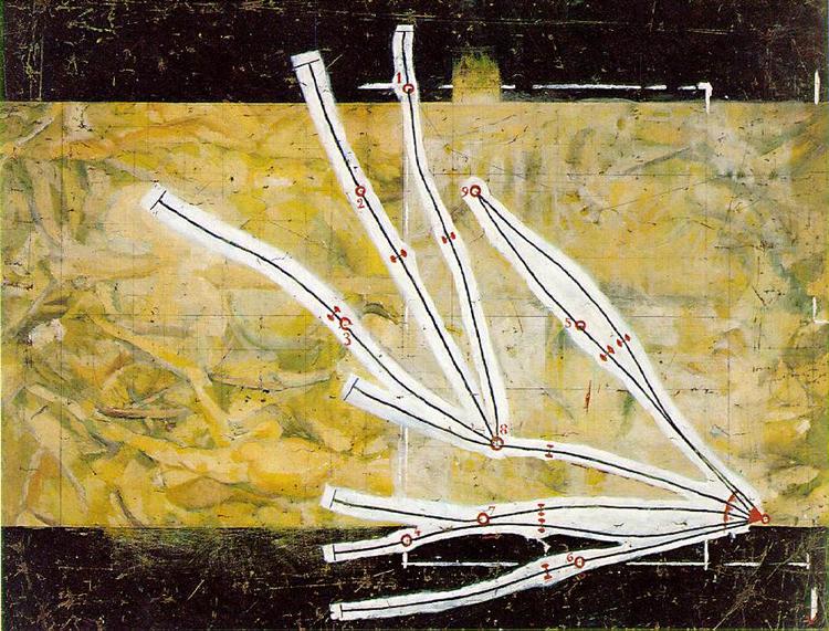
In an effort to move beyond traditional painting, and as a way to comment sardonically on how the standards of measurement are arbitrary, Duchamp dropped one-meter strings onto canvases, then fixed these strings into place exactly how they landed. He described the result as “canned chance,” and declared these randomly generated curves — which he replicated in wooden “rulers” — a new (absurd, personalized) standardized unit of measurement.
Duchamp was fascinated by the work of mathematician Henri Poincaré and Bernhard Riemann. In traditional math (Euclid’s geometry), straight lines are the standard. Duchamp here introduces a geometry without straight lines.
For this particular piece, he traced each of his curves three times in overlapping patterns — resulting in a complex, map-like diagram resembling train tracks. (Or capillary tubes: This composition would form the basis for the capillary tubes in the bottom pane of Duchamp’s 1915–23 mixed media artwork “The Large Glass.”)
It’s worth noting that you can catch glimpses of an unfinished, more traditional painting, as well as a technical drawing, beneath the surface of this work.
If traditional figuration was a representational system that Duchamp was more or less abandoning, chance operation was a replacement. And so was diagrammatic art — which visually maps out an abstract system of measurement rather than presenting a realistic picture of the world.
PS: I recently saw this work in person, at MoMA’s Duchamp retrospective, for the first time. So rewarding.
ALTARPIECE NO. 1 GROUP X

Klint’s so-called Altarpiece trio is a set of three large, abstract paintings — part of “the great commission” of nearly 200 paintings received from Amaliel, one of her spirit guides, in 1906. These are meant to be the spiritual center of the artist’s envisioned “spiral temple.” (Those of us who first encountered these paintings at the Guggenheim’s 2018–19 show Hilma af Klint: Paintings for the Future can vouch for the fact that the Guggenheim became, if only temporarily, a spiral temple of sorts) The Altarpiece paintings illustrate Theosophy’s evolutionary theory, in which “evolution” requires both elevating from the physical to the spiritual and descending from the divine to the material world.
“Altarpiece No. 1” depicts the ascent and descent of the human spirit, featuring a vibrant, upward-pointing pyramid composed of color spectra slicing into a hovering gold-leaf disk. “Altarpiece No. 2” reverses this composition. A downward-pointing triangle suggests the descent of the spirit into the physical, material world. “Altarpiece No. 3” resolves these dualities. It features a large, luminous golden orb — representing an enlightened state, harmony, and cosmic unity — punctuated by spiraling helixes and a blue and yellow six-pointed (Theosophical) star.*
The trio of paintings is diagrammatic, and so are each of its component parts. But “Altarpiece No. 1” — with its color spectra lined up together — is, for me, the most compelling and evocative of these diagrams.
* Theosophists used the six-pointed star to explain the universe. The upward triangle shows the soul’s climb toward spiritual light; the downward triangle shows spirit sinking into the physical world. Together, the triangles show how spirit and matter rely on each other. The circle, which binds the star, represents a limitless, eternal space containing all possible forms of life. Or a semiosphere, perhaps?
CONSTRUCTION NO. 95
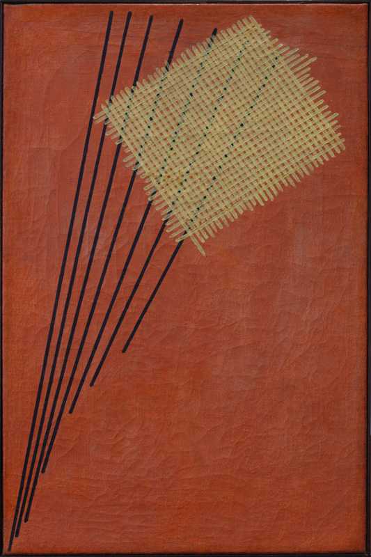
In 1915, Rodchenko — an art student in Moscow, at the time, fell under the influence of Kazimir Malevich’s Suprematism — the goal of which was to free art from depicting / merely copying real-world objects, and (by stripping art down to its barest essentials, by emphasizing visual “purity”) instead aim to express a higher, perhaps universal spiritual and artistic truth. After the 1917 Bolshevik Revolution, he (along with Malevich, El Lissitzky, and others) began to describe themselves as “Productivists” — i.e., engineers of art, creating functional, mass-produced items for workers. Rodchenko’s “Books, Please” poster of 1924 is perhaps the most famous example of this sort of thing.
“Construction No.95” was painted while Rodchenko (and his wife, the artist Varvava Stepanova, also a Productivist) were sharing a house with Kandinsky in Moscow. In the spirit of Russia’s revolutions and upheavals, the artist reduced his work to a purely elemental level of line, color, form and texture. He treated the painted canvas as a “construction” built from essential elements, much like an engineer builds a structure. Rather than depicting 3D space, “Construction No.95” uses a flattened “grid” — a conceptual spatial arrangement that exposes an underlying system of structural relationships, the shaping-and-guiding “lines of force.”
Rodchenko would later credit his investigations from this period as his foremost contribution to the development of ideas in contemporary art.
COMPOSITION WITH GRID 9, CHECKERBOARD COMPOSITION WITH LIGHT COLORS
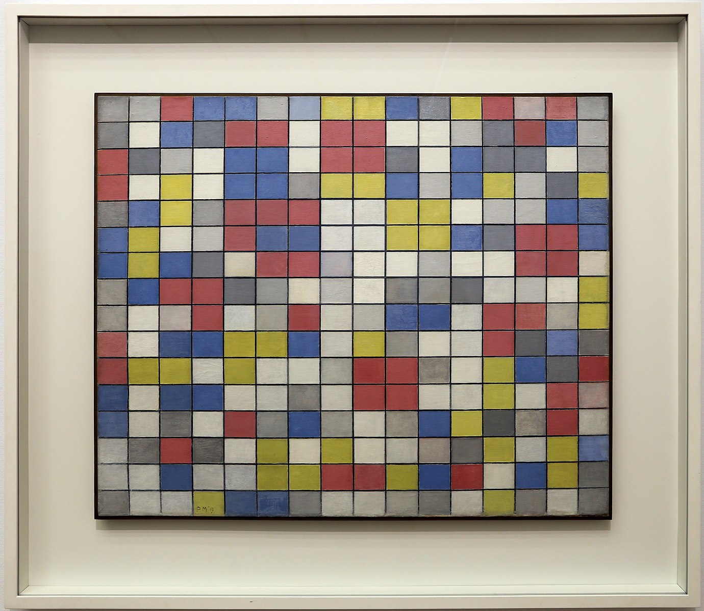
Mondrian’s at this time was becoming more Cubist in his approach — but his work deviates from orthodox Cubism in its theosophy-driven thinking about line and color. His decision to eliminate curves and diagonals from his paintings seems to be motivated by a mystical belief that the vertical and the horizontal represent the two foundational dimensions of existence: the first signifying consciousness, masculinity and the sky, the second unconsciousness, femininity and the earth. In contrast to this eternal binary opposition, curves and diagonals are mere… distractions, I guess.
He also radically reduced color in his paintings to the three primary colors…
Founded in Amsterdam two years earlier by Mondrian, Theo van Doesburg, and others, the art movement De Stijl (“The Style”) took Mondrian’s lead — for a while, anyway — in adhering an abstract style and to unadorned shapes — straight lines, intersecting plane surfaces, basic geometrical figures — and the primary colors and neutrals. They claimed to be investigating the laws of equilibrium in both life and art; their art work were diagrams hypothesizing how these laws might work. And how all antitheses might be resolved harmoniously.
Mondrian explained this and his other works from this period like so: “The unchangeable (the spiritual) is expressed in the composition by means of straight line or planes of non-color (black, white, and gray), while the changeable (the natural) is expressed by means of planes of color and rhythm.” “Checkerboard Composition with Light Colors” is, one understands, a diagram of humankind’s search for unity in counterbalance with the multifarious aspect of nature and the unforeseeable vagaries of life.
NETWORK OR WEB
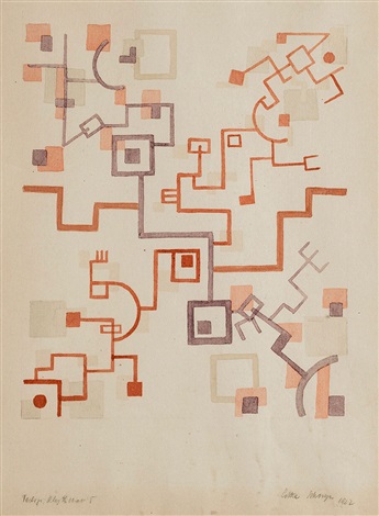
Considered one of the leading avant-garde theatrical and artistic theoreticians of his day, in both design and performance Schreyer championed geometrical balance, purity of color, simplicity and movement. He led the Weimar Bauhaus’s stagecraft workshop from 1921–23, and staged his abstract, controversial, sf-adjacent plays there; he was succeeded by Oskar Schlemmer (see below), on whom he had a profound influence. Following Kandinsky, Schreyer argued for a theater purged of “lifelike referents”, consisting of what the drama historian Mel Gordon describes as “pure sound, pure movement, pure color, pure form”.
In Schreyer’s mystical worldview, art was a spiritual, almost religious discipline. Featuring a strict, rhythmic lattice of intersecting lines, colored forms, and geometric grids, “Network” translates the energetic power of theater’s colors, words, and forms into a diagram — one that suggests how all forces, colors, and human souls are intricately interwoven into a universal cosmic web.
PS: During the 1930s, Schreyer would get involved with Christian mysticism and folk ideas, and ultimately the Nazi ideology. This did not, however, prevent his work being classified by the Nazis as degenerate art.
EGOCENTRIC SPACE-DELINEATION
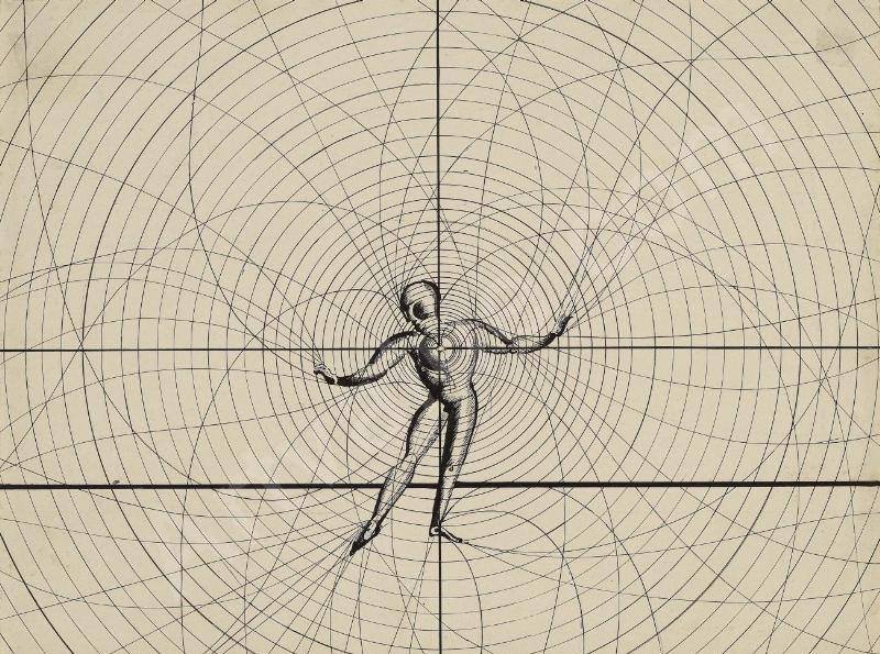
Schlemmer’s architectonic stage / choreography works, like “Egozentrische Raumlineatur,” explore the mathematics or geometry of the structure of human form… and the implications of a dancer’s motion-through-space. The dancer’s “egocentric” movements produce a network of radial motion; the moving body becomes a sort of machine that shapes the space around it. This diagram allows us to glimpse the spatial perception experienced by the performer, his or her perception of volume. Although the dancer may appear to move at liberty, to me this work suggests that there are only so many options available.
COUNTER COMPOSITION XIV
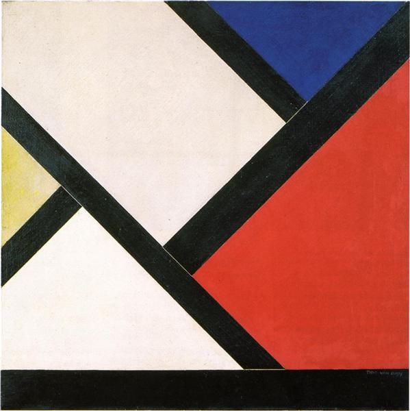
As noted above, Van Doesburg was a cofounder, with Piet Mondrian, of De Stijl. Mondrian’s Neoplasticism insisted that only vertical and horizontal lines were permissible in abstract art… which by mirroring the timeless structures of reality, should function as a symbol for a harmonious society, free from passions and conflicts. Van Doesburg, however, argued that diagonal lines expressed the dynamism of modern life. When he finally published this and other “diagonal” paintings, Mondrian quit De Stijl in protest. The two didn’t speak for two years.
Both artists were creating spiritual diagrams of the universe. But Van Doesburg’s Elementarism (also referred to as Counter-Composition), he claimed, represented a “new polarity” on a higher plane, introducing the element of time and change, advancing artistic expression, and accommodating the evolving human spirit.
COMPOSITION NO. 37
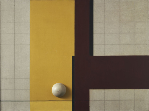
The German De Stijl painter Vordemberge-Gildewart rejected symbolism, narration, or representation in favor of pure form. He called his approach “Absolute Art,” which he grounded in mathematical laws, geometry, and ideal harmony. Trained as a carpenter and interior designer, he did not just paint his canvases; he “constructed” them using cut-outs and sketches, occasionally incorporating physical objects and tactile textures. Abstract forms, he claimed, have their own distinct reality rather than being mere copies of nature.
“Composition No. 37” features an all-over, symmetrical background grid of yellow, brown, and black with a physical, three-dimensional half-sphere mounted directly onto the canvas. The artwork is notable for being one of the first times Vordemberge-Gildewart introduced an organized background grid to his compositions.
Along with Theo van Doesburg and others, in 1931 Vordemberge-Gildewart helped found Abstraction-Création, a loose association of artists counteracting the influence of the Surrealist group.
In 1937, the Nazi regime included Vordemberge-Gildewart’s works in the infamous Degenerate Art exhibition. Most of his art were confiscated and he was forced to leave Germany for the Netherlands.
VARIEGATION IN THE TRIANGLE
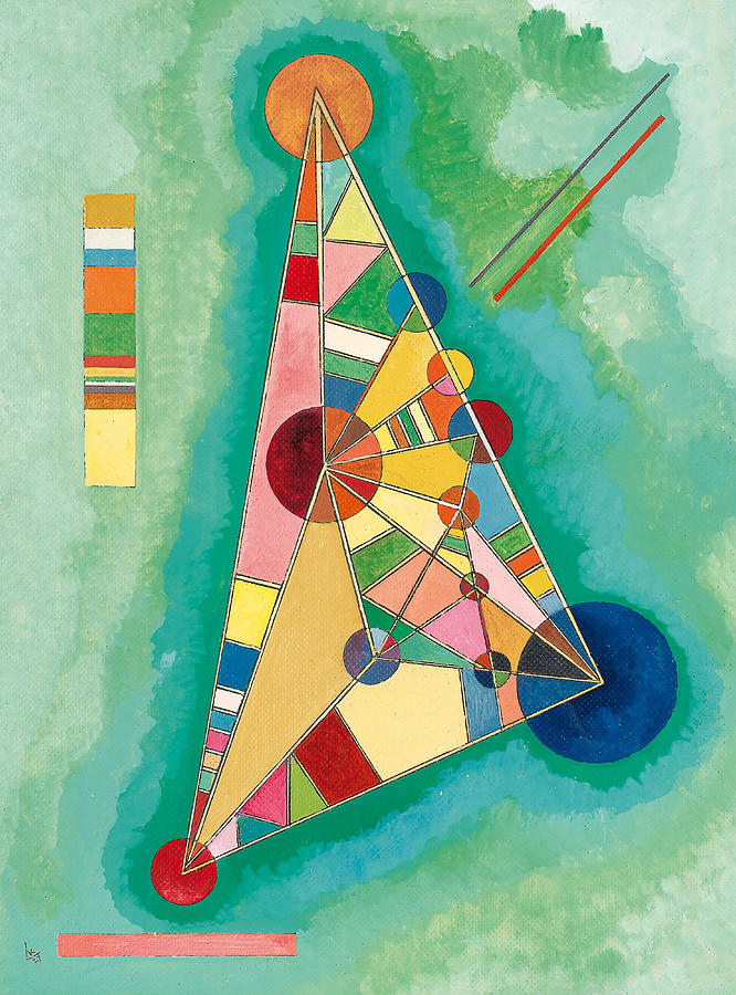
Bunt Im Dreieck (Variegation in the triangle) is — one reads — “one of the most remarkable examples of the philosophy that led Kandinsky to give spiritual value to geometric forms and colors during his Bauhaus years.”
Multiple vibrant, geometric shapes emerge from a levitating triangle set against a serene, sea-green background. Kandinsky viewed the triangle as an active, “living being” that provokes strong, direct emotional responses.
This picture marks a decisive turning point in Kandinsky’s work. Distancing himself from artists who had embraced the rational precepts of Russian Constructivism or Suprematism, Kandinsky increasingly returned to placing intuition and spirituality at the heart of his artistic approach.
As Variegation in the Triangle demonstrates, from this point on his work would be “characterized by lyricism and a simplification of forms: immortalized shapes become calm and solemn and a magnificent range of colors once more nuances his pictures.”
FOUR SPACES WITH RED ROLLING CIRCLES
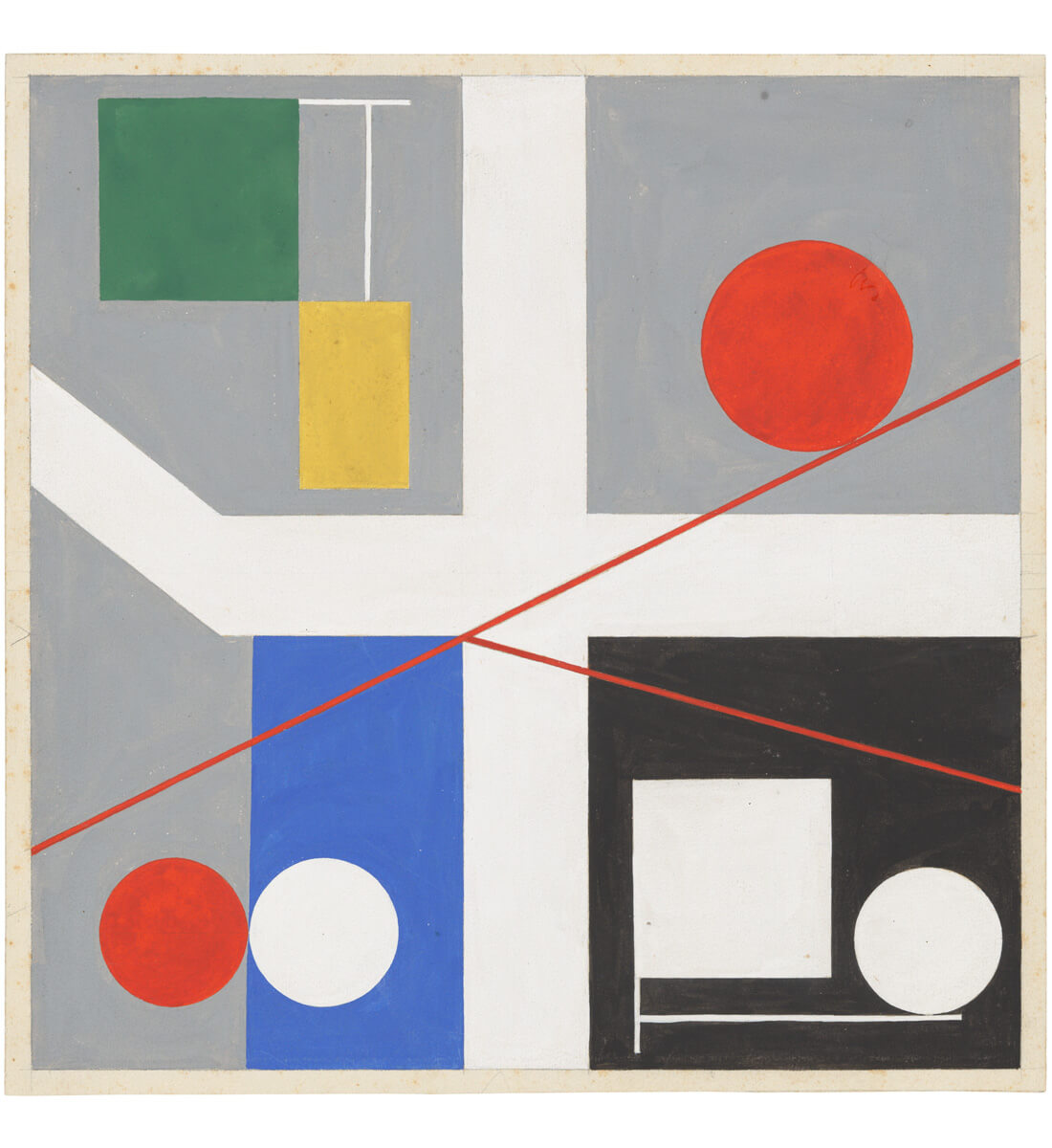
In 1929, Hans Arp and Sophie Taeuber-Arp left Zurich for Paris, where they fell in with a group of artists also exploring non-figurative art. These included: Joan Miró, Wassily Kandinsky, and Marcel Duchamp. Taeuber-Arp joined two artists groups: Cercle et Carré and Abstraction-Création. She also edited the short-lived Constructivist review Plastique/Plastic.
During this period she created some of her strongest work in abstract painting and painted reliefs. These almost all feature perfect circular and rectangular forms depicted in primary colors cast against monochromatic backgrounds. The title “Four Spaces” suggests dynamic kinetic energy, as the red circles are envisioned as “rolling” across and within the partitioned spatial planes of the canvas.
Josh Glenn’s EMANATIONS series includes the following installments: CATASTROPHE: DECLINE & FALL | DYING EARTH | ECO-CATASTROPHE. COSMIC AWE: DEEP TIME | STARS WHEEL IN PURPLE | IS THERE LIFE ON MARS. DEHUMANIZATION: CYBORG MANIFESTO | MECHANIZATION. & many others.
MORE RADIUM AGE SCI FI ON HILOBROW: RADIUM AGE SERIES from THE MIT PRESS: In-depth info on each book in the series; a sneak peek at what’s coming in the months ahead; the secret identity of the series’ advisory panel; and more. | RADIUM AGE: TIMELINE: Notes on proto-sf publications and related events from 1900–1935. | RADIUM AGE POETRY: Proto-sf and science-related poetry from 1900–1935. | RADIUM AGE ART: Proto-sf and science-related fine art from 1900–1935. | RADIUM AGE 100: A list (now somewhat outdated) of Josh’s 100 favorite proto-sf novels from the genre’s emergent Radium Age | SISTERS OF THE RADIUM AGE: A resource compiled by Lisa Yaszek.