
CHROMATIC SUBLIME
By:
August 17, 2026
An installment in EMANATIONS, a series of posts featuring 10 of Josh Glenn’s favorite examples of Radium Age-era fine art that explore a particular proto-sf-adjacent theme. In this case, that theme is DISENCHANTMENT / UNSEEN FORCES. The sub-theme, meanwhile, is…
DISKS OF NEWTON
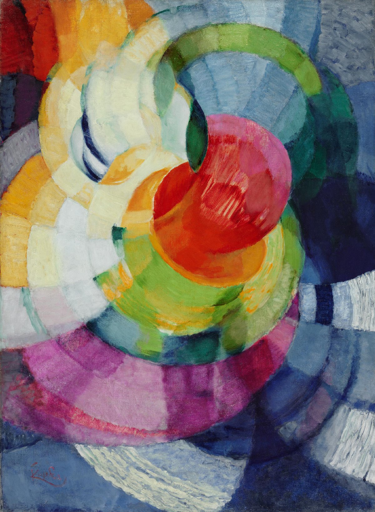
In the 1660s, Isaac Newton’s experiments with prisms demonstrated that clear white light is composed of seven visible colors. Kupka’s radiant series titled Newton-Disques — the installments within which incorporate circular bands of vibrating color, including the full range of the spectrum as well as white — is named for the so-called Newton disk, an 18th century physics experiment. These compositions, which forsake objective forms for what the artist called “invented elements,” are among the earliest examples of pure Abstraction. Kupka here uses pure geometric forms — overlapping spheres and concentric orbits — to evoke a sense of cosmic movement and vibration.
SIMULTANEOUS WINDOWS ON THE CITY
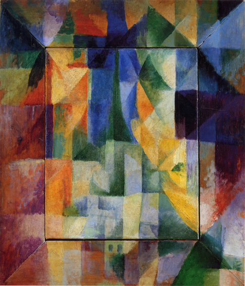
“Simultaneity” was a popular term among avant-garde artists and writers of the era; generally, it alluded to the breakthrough concepts of space and time described by Einstein, not to mention Bergson and others.
Rather than portraying a realistic, photographic view, “Simultaneous Windows” uses fragmented, prismatic colors and crystalline geometric shapes to represent a bustling cityscape filtered through glass and light.
Delaunay studied the science of vision and color theory, particularly the work of M. E. Chevreul and Ogden Rood, which in the 19th century had influenced the Neo-Impressionists. He folded these theories into a mystical belief in color, its fusion into unity (white) symbolizing the possibility of harmony in the chaos of the world. In 1912 Delaunay and his wife Sonia developed an approach to painting light by means of color that they called “Simultanism.” The Delaunays’ friend, Guillaume Apollinaire, instead labelled their work “Orphism” or “Orphic Cubism,” and linked it with the work of other artists whose abstract paintings used color in a manner comparable to the use of sound and rhythm in music.
Here, he juxtaposes translucent, contrasting, and complementary colors to create the illusion of depth, rhythm, and steady, “static movement” without relying on traditional lines or shading.
COLORED RHYTHM
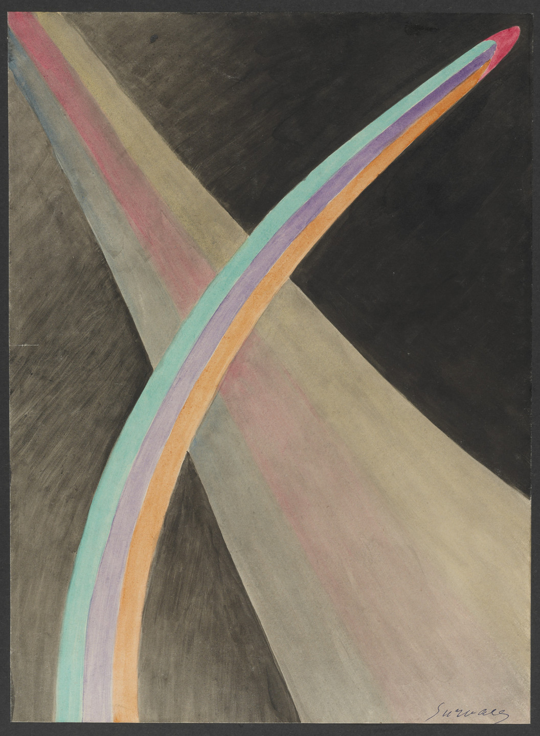
Survage, a Russian-French painter, is widely associated with Orphism. Believing that traditional painting was deadly and static, he wanted to liberate painting from the canvas and introduce the dimension of time and rhythm. The abstract watercolor shown here is one of a sequence of over 100 such paintings conceived as the blueprint for the world’s first abstract color film. The rhythmic, flowing shapes and colors were intended to swell, grow, deflate, and shift into one another, mimicking natural organic growth. Because the technology to animate and project these Survage’s vision did not yet exist and the outbreak of World War I intervened, the film was never realized.
SYNCHROMY IN ORANGE
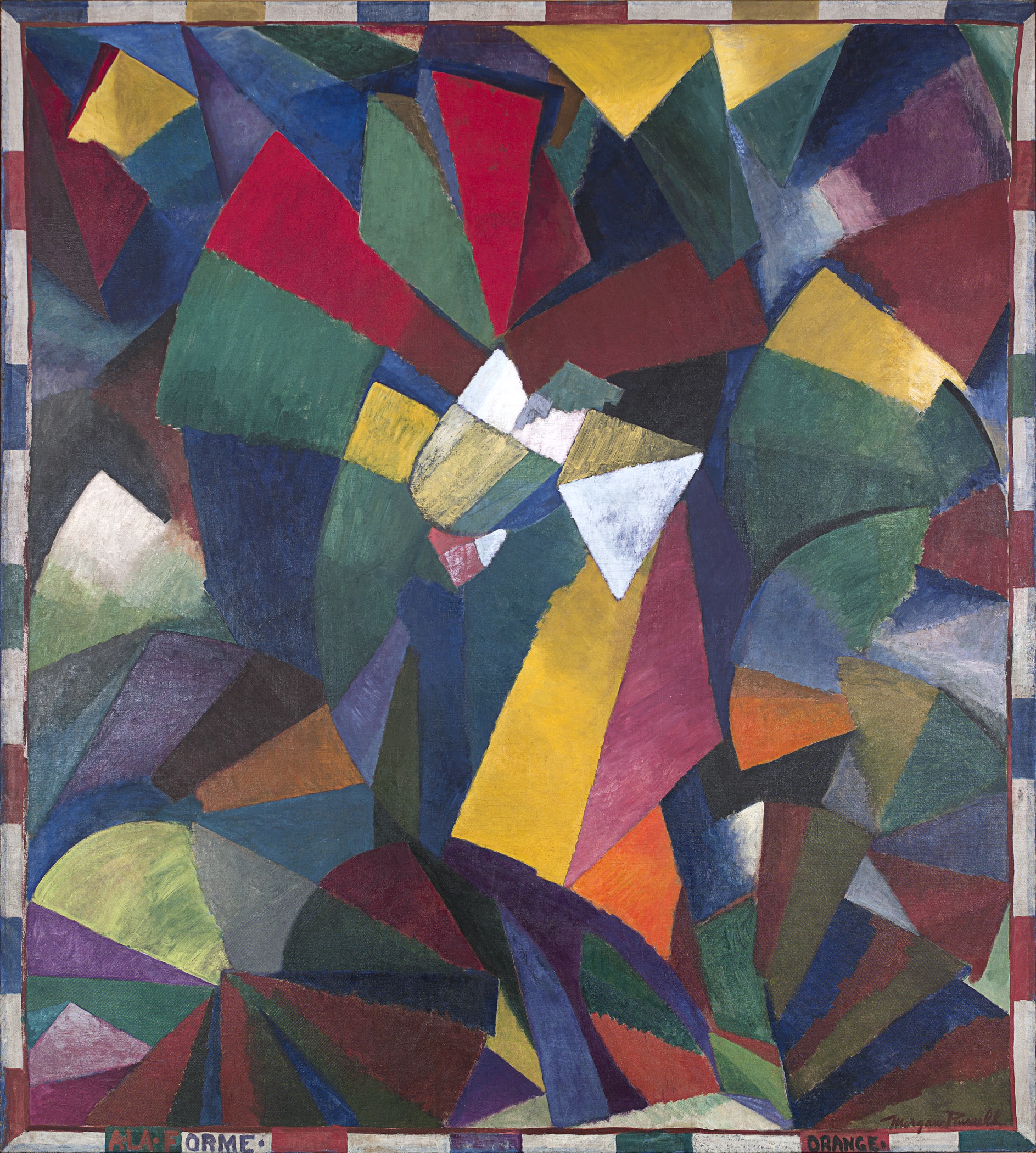
Synchromism was an art movement founded in 1912 by Stanton Macdonald-Wright and Morgan Russell. Their abstract “synchromies” (some of their synchromies were representational) based on an approach to painting that analogized color to music, were among the first abstract paintings in American art. This painting — whose complex composition and impressive scale is a spectacular visual synopsis of the experiments Russell and Macdonald-Wright pursue — is considered a pinnacle work of the movement.
In fact, “Synchromy in Orange: To Form” is only semi-abstract. The painting developed from a pencil sketch that Russell did of Picasso’s Three Women while visiting Gertrude Stein’s Paris salon.
ELECTRIC PRISMS

Delaunay (mentioned above; she is also known as Sonia Delaunay-Terk) is noted for her use of “simultaneous contrasts.” She and Robert Delaumay called their experiments — which involved placing contrasting, vibrant colors side-by-side so they appear to vibrate, shimmer, and move on the canvas — simultanéisme. The goal was to simulate the actual optical sensation of seeing light and color in perpetual motion.
“Prismes électriques” was inspired by a walk down the Boulevard Saint-Michel in Paris, where the artist observed the street’s newly installed electric street lamps — whose intense, dazzling halos of light were distorted and refracted. Critics often say, of this and other paintings from Delaunay-Terk’s “simultaneous” period, that the overlapping shapes and rushing, prism-colored disks convey the same dynamic, forward-moving rhythm found in the poetry of her close friend, Blaise Cendrars. See their joint project La prose du Transsibérien et de la Petite Jehanne de France (1913), here.
SPHERICAL EXPANSION OF LIGHT
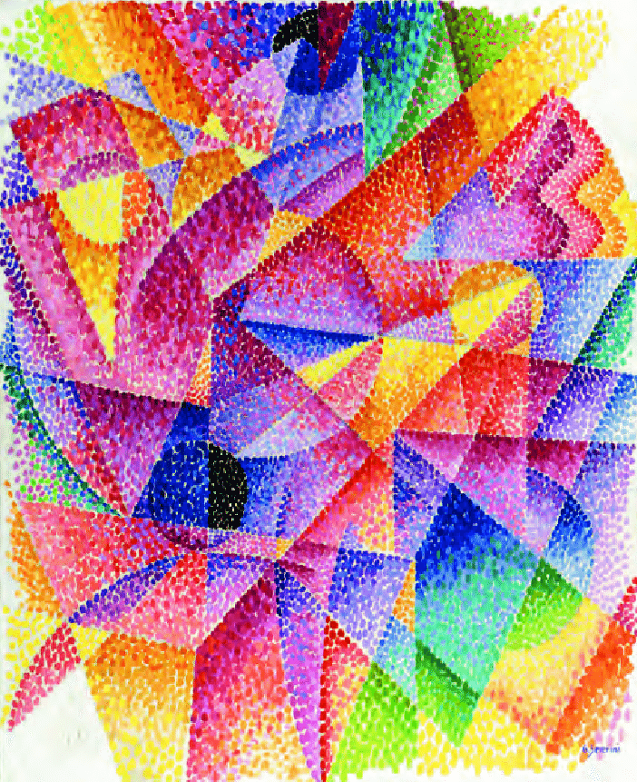
Severini’s painting suggests the invisible, dynamic energies of the universe via prismatic, hard-edged patterns that rotate around dark, light, and mid-range circles. Combining Cubist fragmentation with the Futurist obsession with speed and light, Severini utilizes mobile, scintillating multicolored rectilinear edges alongside sweeping curvilinear forms to create a pulsating, vibrating, proto-psychedelic illusion of motion.
PLASTIC COLOR
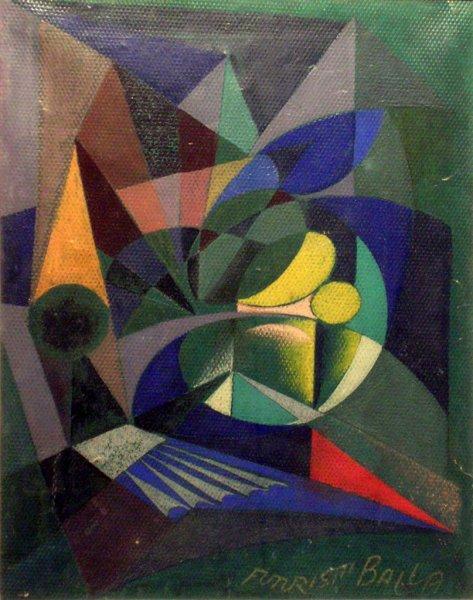
A scientific interest in the movement and effect of light dominates Balla’s Futuristic artworks, which he developed in the winter between 1912 and 1913. He would use bold geometric shapes and radiant colors to suggest (not depict) the sensations of speed and light. Abstracted energy — technology, speed, violence — was prioritized over physical reality.
This painting deploys a striking, contrasting range of deep greens, rich blues, muted yellows, and reds, echoing the artist’s 1918 Manifesto of Color, which promotes a dynamic form of painting that will translate a simultaneity of forces in a “blasting painting, a surprising painting” dominated by “an explosion of color.”
ASCENSION AND PAUSE
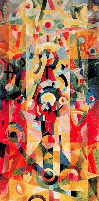
By 1916 Itten was producing artworks in a distinctive vocabulary that both evoked Orphic Cubism and signaled the artist’s commitment to esoteric ideals. Around the time that he produced this painting, he arrived in Weimar to become one of the Bauhaus’s first masters. (He was recommended to Gropius by Alma Mahler who, like Itten, was a committed esotericist.) At the Bauhaus, Itten adopted monkish robes and a shaved head; the coterie around Itten became increasingly cultish and fanatical. Oskar Schlemmer and Paul Klee were hired to reduce Itten’s influence over the program; he departed in 1923.
“Ascension and Pause” blends geometric shapes to show a human soul rising toward a higher, divine light. The base of the painting features a large triangle pointing upward. At the very top of the triangle sits a small, highly abstract figure, which looks like a meditating monk. Above the monk, there are circular shapes. These circles represent a deep pause — a state of perfect stillness, cosmic connection, and spiritual rest. Pepe Karmel writes: “Multi-colored concentric discs explode like small epiphanies.” And it’s been suggested that the painting’s overlapping triangles indicate “resting places” on the pilgrim’s path upwards.
COMPOSITION WITH TRANSPARENT RED, BROWN, AND BLUE
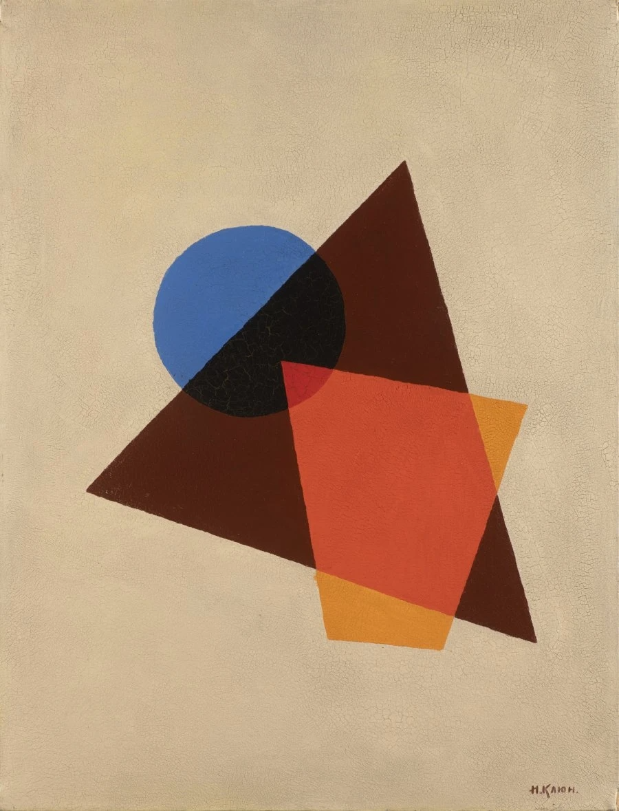
Kliun was a Russian painter, sculptor and art theorist who became friends with Kazimir Malevich in 1907. In 1915 he became a follower of Malevich’s Suprematism — a movement devoted to producing abstract works based upon “the supremacy of pure artistic feeling” (rather than on the figurative depiction of real-life subject); and which focused on simple circles, squares, rectangles painted in a limited range of color. This was the first attempt to independently found a Russian avant-garde art movement.
In his paintings, Kliun explored how scientific ideas — about light, color theory, and cosmic space — could be translated into geometric shapes and abstract art. His “light paintings” use transparent, overlapping shapes to mimic how light rays pass through glass. Like Malevich, he tended to show shapes “floating” — haphazardly — in a vast, weightless universe, free from Earth’s gravity field.
From 1918 to 1921, during the period when this painting was created, Kliun taught at Vkhutemas, the state art and technical school (the Soviet equivalent of the Bauhaus). He encouraged his students to treat art like an engineering problem.
SEPARATION IN THE EVENING
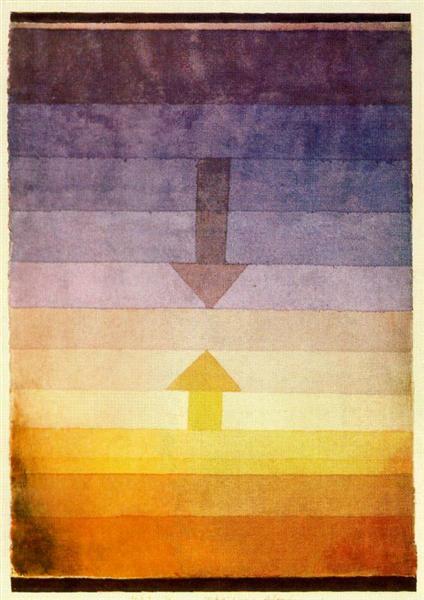
Klee taught at the Bauhaus from 1921 to 1931. Here, he learned to break down his intuitive creative process into clear, mathematical formulas and scientific principles.
Using bands of color (strongly suggesting the sky at dusk) and opposing arrows (which may represent the physical or emotional separation of two things, such as day turning into night or people drifting apart), Klee’s watercolor “Separation in the Evening” creates a dreamlike puzzle.
PS: You can buy Separation in the Evening socks, it appears.
Josh Glenn’s EMANATIONS series includes the following installments: CATASTROPHE: DECLINE & FALL | DYING EARTH | ECO-CATASTROPHE. COSMIC AWE: DEEP TIME | STARS WHEEL IN PURPLE | IS THERE LIFE ON MARS. DEHUMANIZATION: CYBORG MANIFESTO | MECHANIZATION. & many others.
MORE RADIUM AGE SCI FI ON HILOBROW: RADIUM AGE SERIES from THE MIT PRESS: In-depth info on each book in the series; a sneak peek at what’s coming in the months ahead; the secret identity of the series’ advisory panel; and more. | RADIUM AGE: TIMELINE: Notes on proto-sf publications and related events from 1900–1935. | RADIUM AGE POETRY: Proto-sf and science-related poetry from 1900–1935. | RADIUM AGE ART: Proto-sf and science-related fine art from 1900–1935. | RADIUM AGE 100: A list (now somewhat outdated) of Josh’s 100 favorite proto-sf novels from the genre’s emergent Radium Age | SISTERS OF THE RADIUM AGE: A resource compiled by Lisa Yaszek.