4CP FTW (9)
By:
April 14, 2011
[Ninth in a series of 10 posts from John Hilgart’s mesmerizing comic-book details site, 4CP (Four Color Process). We’re thrilled to share Hilgart’s hi-lo way of seeing with our readers.]

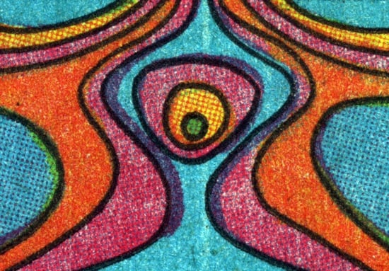
While I prefer to look at Jim Steranko’s late Sixties work in the original printings, you could make a case for the way his art comes across in today’s reprint editions.
Steranko was a young, post-pop-art comic book designer with a commercial art background. He was bringing something back to comics after it had been appropriated from comics for other uses. If he wanted a “comic book effect” in his art, he did it with black and white halftone; he put his own dots in as a controlled simulation of mechanical process. He also embraced solid colors and white space in dramatic new ways that were not about illustrative illusion and that often embraced a flat effect.
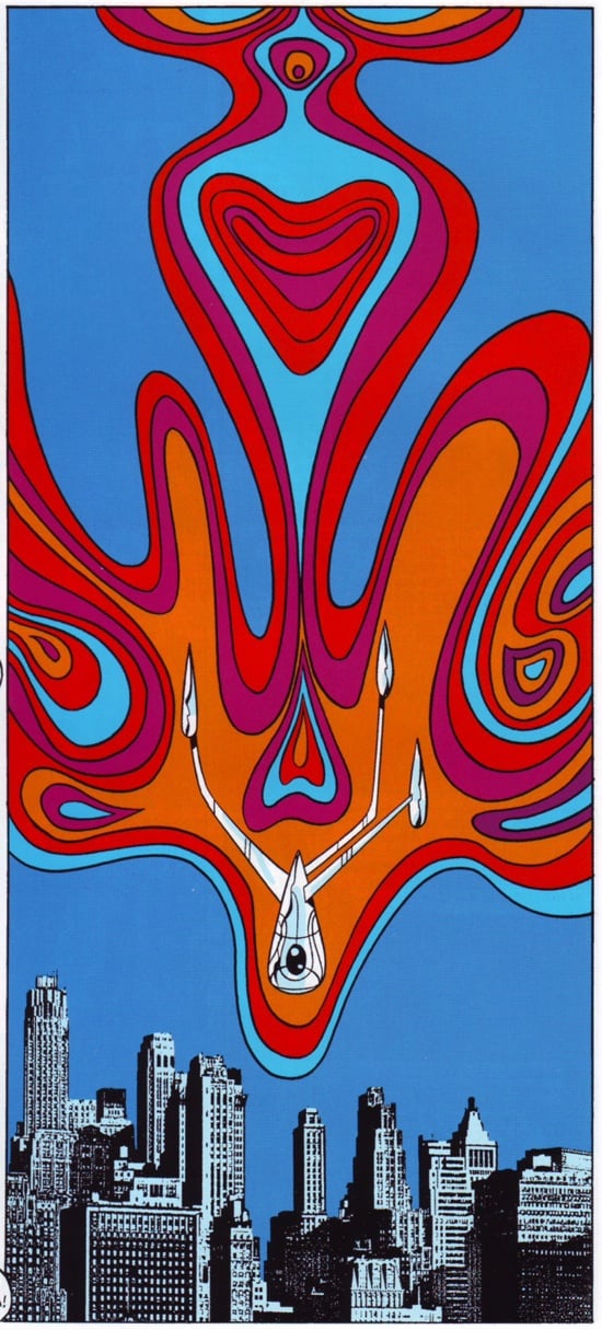
His best panels and pages are Warhol-like, though he also drew some deliberate Lichtenstein frames. Steranko was arguably designing within the genre of comics but against the medium of four-color process. Here’s the full frame as printed with today’s technologies on glossy paper.

