Blow Up Your Comics (1)
By:
March 28, 2012
First in a series of thirty posts by John Hilgart. HiLobrow yields to no one in our admiration for his spelunkery into the mysterious and gorgeous depths of comics that we grew up reading without ever noticing what he’s shown us. Check out the manifesto and FAQ of Hilgart’s 4CP project.
Had HiLobrow invited me a year ago to present the panels from which I’ve cropped and enlarged images for my 4CP blog, I probably would have declined. For the first 100 posts, I deliberately didn’t keep track of the sources. The context of the crops wasn’t beside the point; it was against the point. Everything must go!

At the time, I was carefully documenting my posts on the blog Comic Book Cartography, but 4CP was my personal hunt for chaldrons – ineffable, luminous vessels of desire that feature in Jonathan Lethem’s Chronic City. I was interested only in isolating a certain wild beauty I saw lurking in the microscopic depths of old comics, and I found it in almost every issue I looked at, regardless of publisher, genre, or artist. Once I’d isolated an image – proof of my theory! – I wanted it to have amnesia, to be enigmatic found art.

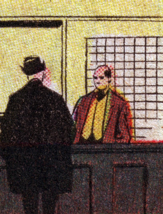
A serene evening scene might come from an Amazing Spider Man battle, a Lois Lane conversation, the space above Moses’ head in Picture Stories from the Bible, or the area just to the left of an attacking 100-foot tall Jack Kirby monster. It’s in the nature of comic art and old four-color printing that isolating a fragment completely severs its ties to what was once around it. Two details from the same panel might be worlds apart, neither remotely suggesting the tenor of the panel they’re from. Autonomy is everywhere, so you can simply isolate the inconsequential and it becomes monumental. It suddenly tells its own story, and nothing else exists to contradict it.

Now that I’ve posted hundreds of images, the 4CP blog appears to me to be an album of snapshots from a single world that was going about its business behind every mid-20th Century comic book. It’s the common denominator, the background noise, the Hollywood lot full of extras.
Whatever it was I was looking for, I found it. These images are something I had always wanted to exist, and to gaze upon, without knowing it. And now they do exist, in embarrassing quantity. In Reed Richards’ fashion, I have used technology to demonstrate the existence of an aesthetic microverse. Which is to say: I’ve shored up sufficient fragments against my ruin, and the contexts of these fragments no longer seem to pose a risk of contamination.
As it turned out, I had succeeded in forgetting where almost all of the images came from, and I had to follow a sticky note breadcrumb trail through my comics to locate sources. It was sometimes startling to see what was going on before I pressed the zoom and mute buttons.

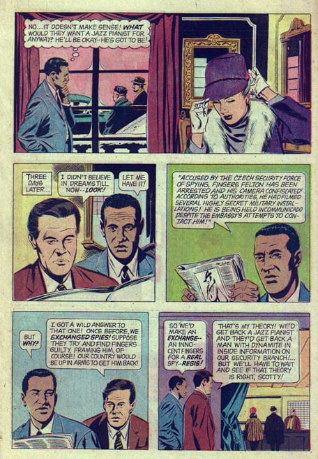
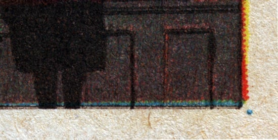
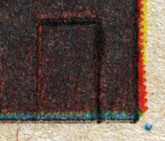
The text and context pairings that this HiLobrow series presents will also supply a reference point for scale, which the 4CP gallery lacks. You can compare full panels and pages to various crazy levels of magnification.
Above all, this series will make it obvious that to discover these worlds within worlds, all you need is a scanner and at least one old comic book (coverless, half destroyed). Try this at home, kids! It doesn’t matter if it’s The Fantastic Four or Lassie; what you’re interested in is much smaller than the titles, genres, characters, and artists. 1960-1975 is something of a sweet spot for good color design, careful color separations, crisp printing, and attention to details in the art. The paper has also aged nicely.
Test your composition with sticky notes applied to the comic book page, then scan it at a far higher resolution than you imagine is necessary. Make a 20MB scan of a postage stamp of comic book, and you’ll get oriented quickly. If you need further assistance, consult the “enhance” scene in Blade Runner.
CREDITS: I Spy 4, 1968, Gold Key
SIMILAR HILOBROW SERIES: SUBSUPERMEN — Golden Age heroes who didn’t make the grade | MASKED MAN | LIMERICKANIA | MEET THE L.I.S. — John Hilgart discovers “implicit superheroes” concealed within comic-book mastheads | 4CP FRIDAY — themed comic-book detail galleries, curated by admirers of John Hilgart’s 4CP project | KIRB YOUR ENTHUSIASM — 25 writers on 25 Jack Kirby panels | ANNOTATED GIF — Kerry Callen brings comic book covers to life | CHESS MATCH — a gallery of pulp fiction chess games | COMICALLY VINTAGE — that’s-what-she-said vintage comic panels | DC — THE NEW 52 — an 11-year-old reviews DC’s new lineup | FILE X — a one-of-a-kind gallery of “X” pulp paperback covers | SECRET PANEL — Silver Age comics’ double entendres | SKRULLICISM — they lurk among us
CLICK HERE for more comics and cartoon-related posts on HiLobrow.
