
FROM EACH…
By:
November 8, 2026
An installment in EMANATIONS, a series of posts featuring 10 of Josh Glenn’s favorite examples of Radium Age-era fine art that explore a particular proto-sf-adjacent theme. In this case, that theme is UTOPIA / DYSTOPIA. The sub-theme, meanwhile, is…
BLAST FURNACES

Garnier (1869–1948) was not an artist but a French architect and city planner. So perhaps it’s cheating, a bit, to include his drawings for an ideal industrial city — initially exhibited in 1904, then published in 1918 as Une Cité Industrielle: Etude pour la construction des villes — in this series. There are other architects in this post too.
In 1901, after studying sociological and architectural problems, and operating under the influence of Zola’s 1901 novel Travail (Work), about an engineer who works to reform a steelworks under a utopian, cooperative model inspired by Fourier’s socialist theories, Garnier began to dream up a city in which labor is honored. For example, the industrial zone of his Cité Industrielle is segregated from residential zones by a green belt. This notion would directly influence the next generation of architects / urban planners, notably Le Corbusier.
This plate showcases Garnier’s radical (at the time) endorsement of reinforced concrete (béton armé). The colossal structures of the blast furnaces are rendered with a stark, unornamented simplicity. These bold, geometric, utilitarian concrete forms prioritize raw structural efficiency and open spatial planning. Rejecting fake facades, historicist ornamentation, and bourgeois pretense, and exposing raw concrete, brick, and steel “as found,” Garnier aimed to show how industrial buildings were made — and how society should operate without hidden hierarchies. Some architecture historians go so far as to say that Garnier treats blast furnaces, here, with the same dignity and scale that ancient civilizations applied to temples or acropolises.
Today, many of us find massive, unornamented concrete surfaces cold, intimidating, oppressive. And it doesn’t help that these so-called “Brutalist” structures often suffer from chronic underfunding, poor maintenance, and weathering that has left them stained, damp, or crumbling. Still, the vision was a utopian one…
NEW CITY

Sant’Elia (1888–1916) was an Italian architect. Notable for his visionary drawings of the city of the future (mostly created c. 1912–14), when he died in World War I at age 28 he left behind almost no completed works of architecture.
A group of Sant’Elia’s drawings, Città Nuova (“New City”), was displayed in 1914 at an exhibition of the Nuove Tendenze group. These drawings were another influence on later architects and city planners like Le Corbusier, whose unrealized Ville Radieuse (“Radiant City”), like Sant’Elia’s Città Nuova, is characterized by central planning, ease of transport, and the overall organization of its inhabitants.
Breaking away from historicism (classical columns, symmetry, historical decorative styles), here we find buildings that look and function like machines. Rather than a single ground-level street, this is a multi-tiered, interconnected city where traffic, pedestrians, and transit occupy separate vertical planes. By placing staircases and elevators on the exterior of his buildings, long before the inside-out Centre Pompidou, Sant’Elia externalized the mechanical core of his buildings, making a virtue out of what architects regarded as mere functional utility.
DYNAMIC CITY
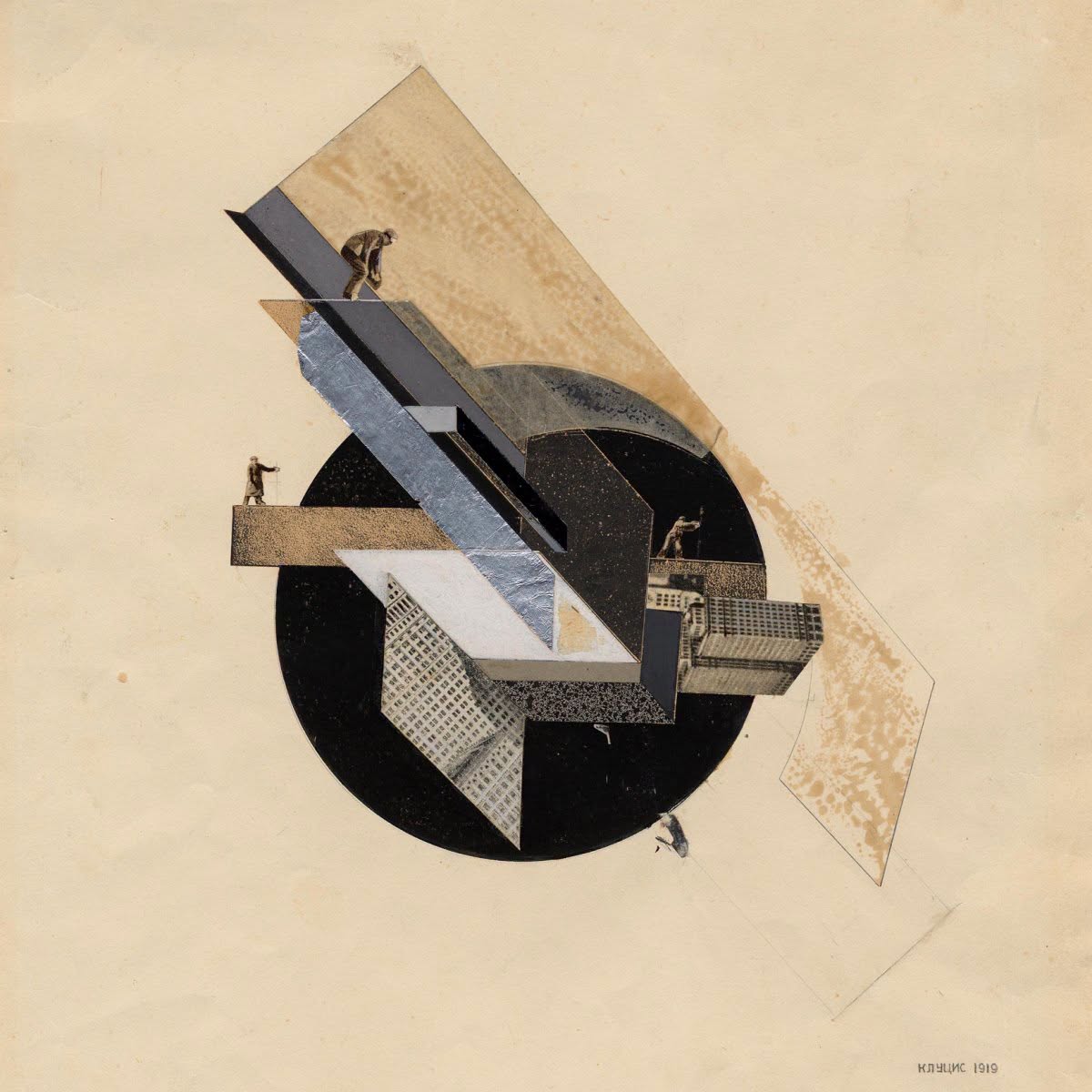
More or less at the same time that Dadaist German artists like Grosz and Höch were reinventing the photomontage, Russian Constructivist artists such as El Lissitzky, Rodchenko, and the husband-and-wife team of Gustav Klutsis and Valentina Kulagina created photomontages for propaganda purposes. However, while the Dadaists used chopped-up images to express chaos and institutional decay, the Constructivists used the technique as an integrated, highly structured political tool to celebrate, e.g., labor, electrification, and state building. From a Constructivist perspective, after all, the artist is less a critic than a kind of engineer pitching in to construct a new society.
Beginning in 1919, Klutsis’ photomontage series Dynamic City (also known as “Plan for the City of the Future”), which bridge the abstract spiritualism of Malevich’s Suprematism and the utilitarian, politically engaged ethos of Constructivism, offered an architectural vision of a socialist utopia. The intersecting minimalist planes of the image gere represent industrial structures and technological progress… but also cosmic expansion. Deploying what Klutsis termed “axonometric painting,” the composition features a circular planet or global disk floating in space; Soviet artists were into space travel.
PS: An axonometric projection is a type of parallel projection used to display a three-dimensional object on a two-dimensional surface where multiple sides are visible at the same time without using traditional vanishing points.
The modern city is an ever-shifting yet monumental construct; thus, linear perspective has been banished. Klutsis here uses fragmented imagery, repeated motifs, and diagonal alignments to suggest a spinning, multi-directional visual field. (The intersecting diagonals, which convey aggressive momentum, are inherited from Futurism.) In this non-Euclidean space there is no fixed top or bottom. The human construction workers and skyscraper fragments are pinned along different axes of the circle, oriented outward as if responding to an internal center of gravity. In fact, the piece — which forces us to shift our own perspective — seems designed to be rotated. It is a revolutionary work of art.
By 1923, one will find evolved versions of Dynamic City — graphic, photomontage, and lithographic iterations that integrate architectural forms, geometric planes, and urban dynamics.
Despite his decades of service producing Soviet propaganda, in 1938 Klutsis was arrested (alongside many other ethnic Latvias, intellectuals, and artists, as part of Stalin’s “Latvian Operation”), accused of participating in a “counter-revolutionary nationalist terrorist organization,” and executed by a firing squad.
CONTRA CONSTRUCTION
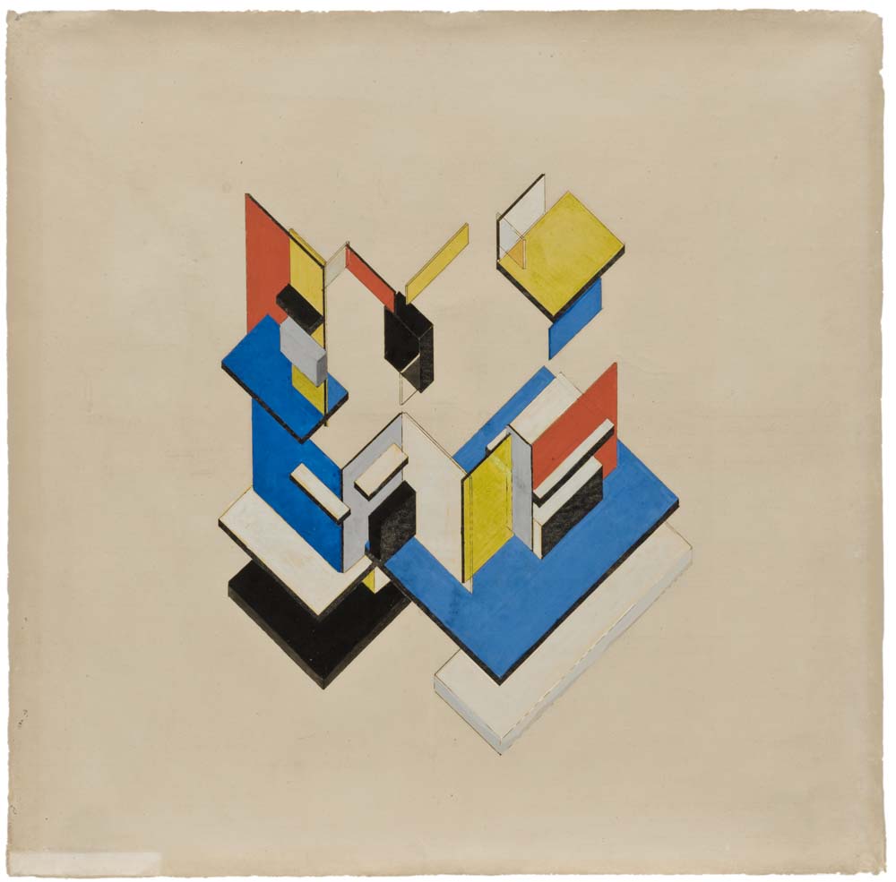
From MOMA’s “Inventing Abstraction” series:
Van Doesburg understood modern architecture and modern painting as complementary, arguing that the two mediums had something basic in common: the flat plane. He believed that painting could serve as a laboratory for testing architectural ideas. These works in gouache were not intended as plans for a specific building but as abstract explorations of spatial relationships. Van Doesburg began with plans for private houses that he had developed with the architect Cornelis van Eesteren. Then he eliminated the signs of functional architecture: doors, windows, and roof are all absent, and no directional cues distinguish front from back. Instead, the structure floats freely in space and time.
By using oblique parallel (axonometric; see above) projection rather than human-eye perspective, van Doesburg aimed to remove personal artistic subjectivity and optical illusion. His drawing treats space as infinite and continuous, art historians tells us, thus allowing two-dimensional and three-dimensional qualities to coexist.
Exhibited in Paris in 1923, “Contra Construction” helped cement De Stijl’s geometric vocabulary, and it would directly influence teaching philosophies at the Bauhaus.
CANTILEVER CUPOLA
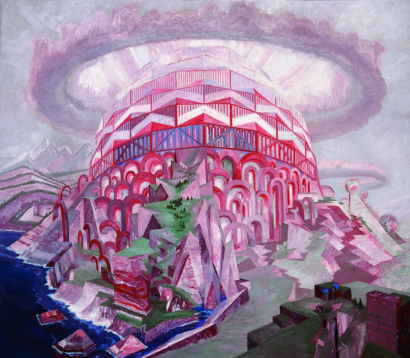
As noted in an earlier installment in this series, Hablik was a German Expressionist artist, architect, and craftsman who believed that crystal formations and natural geometry could serve as templates for a new world. An outgrowth from Hablik’s series on “Flying Cities” — massive, self-contained architectural spaces that could hover or project out over natural landscapes — Cantilever Cupola was created at a time when Hablik was associated with the Bauhaus movement.
Here we find an impossible, towering yet apparently weightless architectural space that blends structural engineering with organic, natural geometry. Rather than resting on a man-made foundation, the structure rises directly out of the titular five hilltops. The building looks half-grown rather than built. There’s also a touch of German Romanticism, here: the sky, the cupola, and the landscape glow with an otherworldly intensity.
The painting, one hears, is a key historical example of how early 20th-century European modernism sometimes used (what we’d now call) fantasy and science fiction concepts to reshape the boundaries of art and design. This painting certainly looks like the cover to a 1960s sci-fi paperback, doesn’t it?
FAMILY PORTRAIT II

Molzahn’s early and 1920s work, which combined fragmented geometric shapes with abstract and figurative elements, is often described as Cubo-Futurist. However, art historians also associate Molzahn with Expressionism, Constructivism, and the Bauhaus milieu. Whatever the case may be, even a cursory glance at Family Portrait II persuades us that this artist celebrated the machine aesthetic and geometric abstraction as forces of societal renewal. Rather than treating industrial development as alienating, that is to say, he envisioned — naively, we might say from out perspective — a spiritually elevated harmony between humankind and its technologies.
Rather than portray the family in a sentimental, old-fashioned way — per the predilections, for example, of Germany’s Nazis — here Molzahn offers an optimistic vision of a future family that has become structured, rationalized, and integrated — within the precise spheres, interlocking lines, and geometric planes of a diagram or chart — like components of a machine. Despite the painting’s rigid geometry, the glowing color fields and floating geometric elements suggest a cosmological ordering of life.
Despite their apparent lack of freedom within this schema, one has to admit that this family is quite stylish. I enjoy the fact that their intermeshing with whatever the diagram’s lines of force are meant to represent doesn’t seem to control their thoughts or actions so much as it does their groovy avant-garde outfits.
Family Portrait II was included in the historic International Exhibition of Modern Art organized by the Société Anonyme at the Brooklyn Museum in 1926 (curated by Katherine Dreier and Marcel Duchamp). Positioned as the cutting edge of German abstraction, it was then absorbed into the permanent collection of the Société Anonyme. Which protected it from the fate of Molzahn’s similarly titled painting Family Portrait, which was seized from German museums by the Naxis and displayed in their 1937 “Degenerate Art” exhibition.

PS: Is it my imagination, or does the figure at left look very much like Mr. Spock (as portrayed by Leonard Nimoy) in a dress?
UNISEX SPORTS APPAREL

Speaking of groovy avant-garde outfits…
Stepanova (1894–1958) was a Russian avant-garde artist, painter, poet, and co-founder of the Constructivist movement. Her design for unisex sports apparel (which she referred to as Sportodezhda) was created during the post-revolutionary Soviet era; the intent was to redefine fashion by rejecting elitist bourgeois style / production in favor of radical functionality, gender equality, and mass production.
In order to built a utopian society, according to the Constructivists, art must leave the isolation of the gallery and enter the factory floor. Clothing, meanwhile, ought to become strictly utilitarian. Ornamentation, traditional tailoring, even buttons were bourgeois. Stepanova’s sports uniforms were ergonomic — i.e., designed entirely around the movement of the human body in action. The patterns and contrasting color blocks were engineered to visually track and accentuate athletic performance and flexibility; and to distinguish between rival teams, of course.
And as for the notion that male and female athletes were essentially different? Nonsense. The “Soviet New Woman” would have no need for corsets and heavy skirts. Stepanova’s design is gender-neutral, androgynous.
Though the technological limitations and material shortages of the early Soviet state prevented these exact designs from being mass-manufactured on a large scale at the time, here we can see today’s tracksuits, athletic apparel, and athleisure-wear.
THE METROPOLIS OF TOMORROW

According to Eva Miller, writing for the Public Domain Review in 2025, about Ferriss’ 1929 treatise Metropolis of Tomorrow:
In a dramatic, monochrome rendering in ink and charcoal, a fractal of pyramids and steps regenerates at different scales and angles. Vertiginous towers, the tallest outgrowing the frame, ascend from a base of tiered structures — ziggurats — rising in regular terraces. The roofs of lower blocks are dotted with miniscule trees that echo the larger, manmade shapes around them. They are the only living things visible at this scale, but an accompanying text tells us that this skyline is populated with people, citizens who enjoy the city’s elaborate roof gardens, sun porches, and open-air swimming pools.
Ferriss (1889 – 1962) was an architectural delineator. In 1922, at a time when his stylized, uplit drawings of skyscrapers often appeared in magazines, an architect hired him to draw a series of perspectives demonstrating the consequences of New York City’s latest zoning law. These drawings and others would appear in his 1929 book The Metropolis of Tomorrow, which included everything from theoretical studies of skyscrapers to a sequence of views in which Manhattan becomes almost Babylonian in aspect.

The Metropolis of Tomorrow presents a romantic vision for an ideal city of the future based on logic, order, and human ingenuity; it is a manifesto for solving real-world urban problems such as of density, traffic, and light deprivation. But because Ferriss’s illustration style (massive, monolithic, shadowed structures rendered in heavy charcoal) is quite moody, and because Ferriss was (in some parts of the book) issuing dire warnings about possible future trends, the book also inspires in readers a dystopian dread.
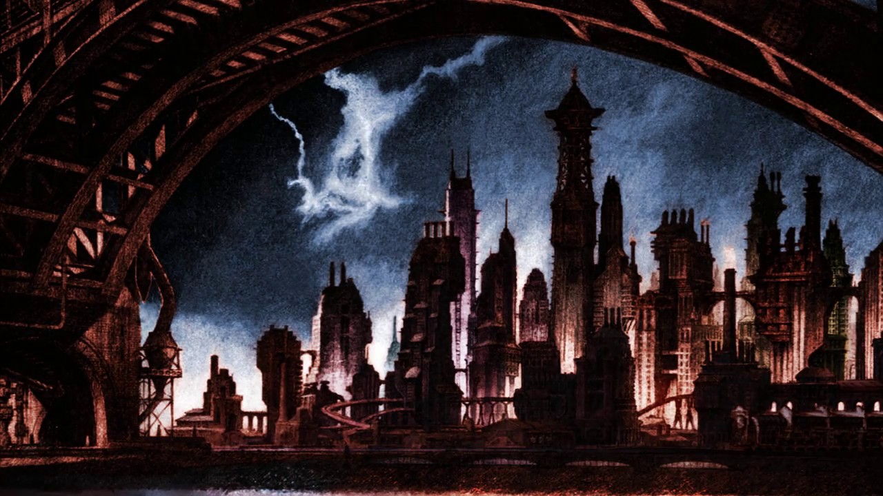
Fun fact: Production designer Anton Furst, who created Gotham City for Tim Burton’s 1989 Batman as a dark, oppressive “parallel universe New York” built from a chaotic mix of architectural styles, was influenced by Ferriss’s book.
ARCHITECTURAL FANTASY

Chernikhov’s series Architectural Fantasies: 101 Compositions was published in 1933. These compositions do not represent buildable, functional structures. Instead, they are an exercise in speculative, visionary “paper architecture” — design that exists to stretch the limits of spatial imagination. “Not without reason […] have great thinkers of all times accorded vast importance to fantasy, as being the forerunner of any kind of progress,” he explained, in a utopian vein — reflecting the avant-garde culture of the new Soviet Union. “To look one-sidedly at the idea of fantasy and not to consider its positive role in all fields of culture and art — this is to make a great mistake.”
Like his fellow Constructivists, Chernikov embraced geometry because he viewed it as the ultimate visual language of the modern, industrial world — and a tool for social revolution. About his abstract, geometric architectural visions of steel beams, geometric intersections, and machine-age cities, the MoMA website has the following to say:
The excitement and brilliance of Chernikov’s fantasy lie in his dynamic handling of diagonal lines, ellipses, and bright colors, presented in a dizzying axonometric view. The imagery, unabashedly industrial in character yet devoid of any context or program, is remarkably fresh and pregnant with possibility.
That possibility would not be realized, though. All those sharp rectilinear grids with sweeping curves, diagonals, and hovering volumes? Stalin’s repressive regime, which favored a banal architecture based on monumental classicism and Social Realism, effectively put an end to Constructivism in the 1930s. Chernikov’s most famous and primary built structure is the constructivist water tower and rope workshop at the Red Nailer factory in St. Petersburg, built from 1929–1931.
DESTRUCTION AND CONSTRUCTION
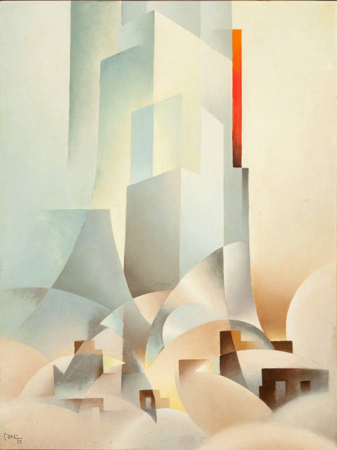
The destruction of the past, according to the Futurists, is necessary to construct the future. Crali’s utopian vision of a future metropolis, therefore, doesn’t fail to indicate the dismantling of traditional structures.
The constructive top half of the painting features clean, soaring vertical lines, pristine arcs, and block-like mechanical volumes. A new world — ordered, synthetic, and industrial — is literally rising ot of the ashes of the old. The destructive bottom half of of the painting suggests abandoned old buildings, falling into ruin, shrouded in smoke. One thinks of (the libertarian/conservative authors) Larry Niven and Jerry Pournelle’s 1981 sci-fi novel Oath of Fealty, about a massive, self-contained arcology — a gigantic, luxury condo building and independent city-state — rising out of dystopian, near-future Los Angeles.
Overlapping triangles, interlocking chevrons, and sweeping vectors make the viewer’s eye move constantly across the surface of this image. The act of tearing down and building up are superimposed; they happen at the exact same moment.
Josh Glenn’s EMANATIONS series includes the following installments: CATASTROPHE: DECLINE & FALL | DYING EARTH | ECO-CATASTROPHE. COSMIC AWE: DEEP TIME | STARS WHEEL IN PURPLE | IS THERE LIFE ON MARS. DEHUMANIZATION: CYBORG MANIFESTO | MECHANIZATION. & many others.
MORE RADIUM AGE SCI FI ON HILOBROW: RADIUM AGE SERIES from THE MIT PRESS: In-depth info on each book in the series; a sneak peek at what’s coming in the months ahead; the secret identity of the series’ advisory panel; and more. | RADIUM AGE: TIMELINE: Notes on proto-sf publications and related events from 1900–1935. | RADIUM AGE POETRY: Proto-sf and science-related poetry from 1900–1935. | RADIUM AGE ART: Proto-sf and science-related fine art from 1900–1935. | RADIUM AGE 100: A list (now somewhat outdated) of Josh’s 100 favorite proto-sf novels from the genre’s emergent Radium Age | SISTERS OF THE RADIUM AGE: A resource compiled by Lisa Yaszek.