
GEOMETRICAL UTOPIA
By:
November 16, 2026
An installment in EMANATIONS, a series of posts featuring 10 of Josh Glenn’s favorite examples of Radium Age-era fine art that explore a particular proto-sf-adjacent theme. In this case, that theme is FAR-OUT MATHEMATICS / FOURTH DIMENSION. The sub-theme, meanwhile, is…
Of course, this sub-theme also belongs to the theme UTOPIA / DYSTOPIA.
WHITE ON WHITE
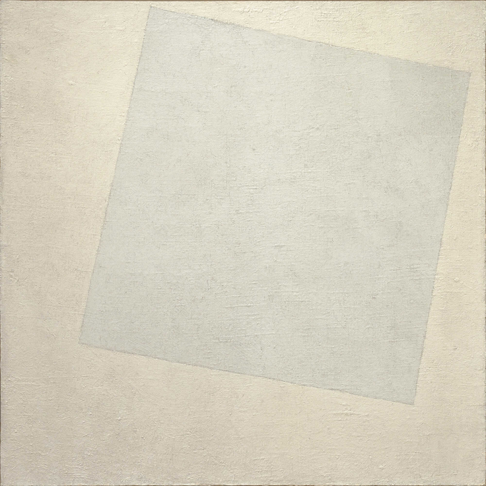
In Malevich’s 1927 book The Non-Objective World, a key theoretical document of abstract art, he reminisces: “In the year 1913, trying desperately to free art from the dead weight of the real world, I took refuge in the form of the square.” Triggered by the Russian Revolution, as of 1917 the austere, escapist (cf. his use of the term “refuge”) meaning of Malevich’s Suprematism — an abstract art movement focused on the “supremacy of pure feeling or perception” rather than the (limiting) depiction of real-world objects — shifted to a utopian vision.
Unveiling the painting Black Square in 1915, Malevich declared his intention to return to the “zero of form.” Suprematists would look beyond material reality; the concepts they found there would be communicated via simple geometric shapes. However, though he insisted that he was interested entirely in unconditioned, internal spiritual and psychological sensations, Malevich’s early Suprematist works were “read” by some — including his fellow Suprematists — as an allegory for the need to “wipe the slate clean” in Russia… i.e., via revolution.
Following the Revolution, the meaning of Suprematist art expanded from a private, metaphysical quest into a language of radical social and political liberation. White, for Malevich, became the color of a non-Euclidean — which is to say, utopian — dimension. His was a vision of a quasi-transcendental new world free of bourgeois social, cultural, and economic bullshit. The slight tilt of the square, in the painting above? It was meant to indicate dynamic progress — i.e., utopia wasn’t going to simply develop on its own.
Malevich briefly aligned with the new revolutionary state, serving as Deputy Director of the Art Section by the Moscow Soldier’s Council in 1917 and instituting free studio programs. In 1919, he joined the Vitebsk Art School, where he and his artist colleague El Lissitzky formed UNOVIS (Affirmers of the New in Art), a group that spread Suprematist designs across public banners, buildings, trains, and posters for the new society. Nevertheless, Malevich’s absolute insistence on a “zero of form” left Suprematism looking increasingly isolated, out-of-touch, and politically vulnerable in a rapidly collectivizing society.
GEOMETRIC COMPOSITION

Did Suprematism clash with Constructivism, the members and supporters of which demanded that artists conceive of themselves as engineers building machinery, factories, and tools for the industrial state? It did: One Constructivist critic quipped that White on White was the only good canvas in an exhibition by the UNOVIS group: “an absolutely pure, white canvas with a very good prime coating. Something could be done on it.” (Which is pretty funny.) Alas, these rival art movements would both be suppressed when, in 1934, avant-garde abstraction was banned in favor of the USSR’s official doctrine of Socialist Realism.
Although Rodchenko’s early non-objective abstract work (like Geometric Composition, shown here) was heavily influenced by Malevich’s Suprematism, c. 1919–1921 he would break away not only from the Suprematists but — for ideological reasons — fine art in general. In 1921 he’d help establish the Constructivist Work Group, which “constructed” functional, utilitarian art — from industrial design and architecture to textiles, book covers (including Radium Age science fiction), etc. — that would serve a practical purpose. (And, of course, propaganda posters. So many propaganda posters.) He was one of the first Constructivists.
Here, however, Rodchenko is still working in the Suprematist mode. Even before becoming a Constructivist, he utilized tools like a compass and a ruler to construct his compositions — seeking to intentionally eliminate expressive, individualistic brushwork. The painting here, which is not transcendent like Malevich’s work from the same year — which instead emphasizes intersecting planes and concrete physical properties — is a rebuke to Malevich’s Suprematism.
Before he’d eschew easel painting altogether, Rodchenko used canvases like this one as a workspace or laboratory for structural invention. The precise arrangement of lines, circles, and intersecting arcs is an aesthetic cognate, or so the artist believed, of the early Soviet state’s much-needed industrialization, engineering, and scientific optimization.
PAINTERLY ARCHITECTONIC
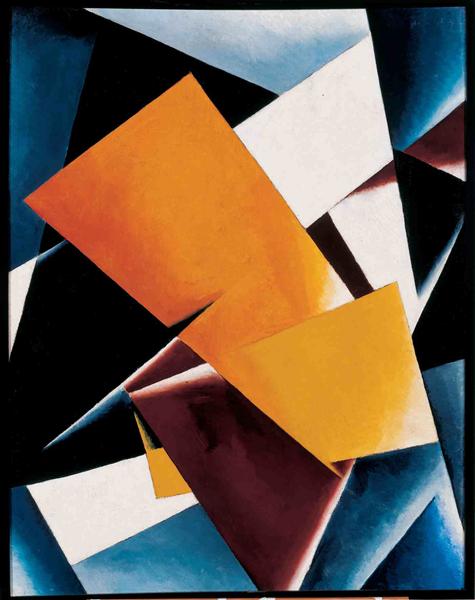
Like Rodchenko, Popova was — at the time of this painting, anyway — a Suprematist. Her signature non-objective geometric abstract style (c. 1916–18) was known as “Painterly Architectonics.” She chose this terminology because: Instead of using the canvas to mimic a window into the real world, she wanted to build an image from scratch using structural rules. Unlike Malevich, she didn’t view non-objective art as a highly spiritual, mystical, or metaphysical exercise; for her, paint and color are real, objective materials that ought to have real-world presence.
In reference to an earlier (1917) painting of Popova’s of the same title, at MoMA’s website we read:
In counterpoint to the expansive white backgrounds of Kazimir Malevich’s Suprematist paintings, Popova creates what appears to be a tight, shallow container for geometric forms that seem to push outward from it. Her model of abstraction is suggested by her use of the term “architectonic”: treating planes almost as solid material entities, Popova builds a monumental composition focused on the interrelationships between individual parts.
By abandoning traditional, illusionistic representation in favor of pure geometric forms, planes, and lines, Popova sought a universal visual language unmoored from the old czarist order. The “structures” she was painting on canvas represented blueprints, of a sort, for a new, rationally ordered world.
In 1921, Popova would embrace Constructivism. Led by Rodchenko and Vladimir Tatlin, this movement fiercely rejected Suprematism as “self-indulgent mysticism.” Poor Malevich!
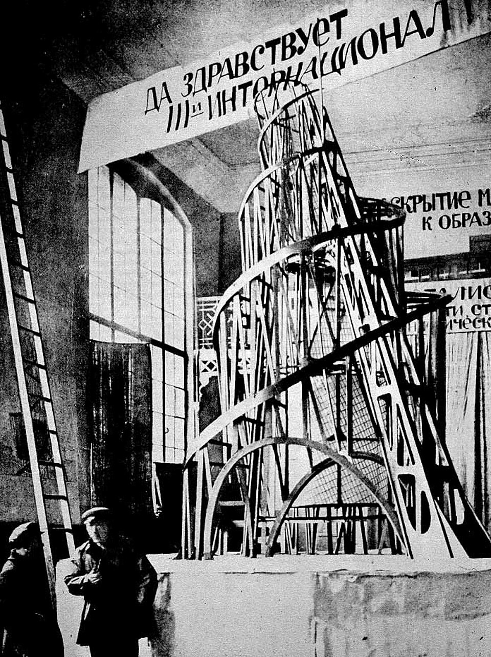
MONUMENT TO THE THIRD INTERNATIONAL
Speaking of Tatlin… He and Malevich started out as colleagues in the Russian avant-garde movement. But Tatlin wasn’t interested in Malevich’s mystical utopianism. He came to believe that utopian art must serve a social, practical function — and focus on industrial materials — i.e,, not easel painting. Tatlin was the father of Constructivism, an austere artistic movement that emphasized art’s societal purpose — collectivity over individuality, aesthetics merged with industry. Geometric abstraction, industrial materials, and bold colors and graphics defined its aesthetic.
At the 0.10 Exhibition, a landmark exhibit of Russian avant-garde art in 1915 (at which Constructivism, led by Tatlin, first emerged publicly), the two former friends got into a fistfight. Also, according to art-world legend, Tatlin once kicked a chair out from under Malevich, telling him to go sit on his abstract “categories of shape and color” instead. (This doesn’t sound like a real incident, to me. But it’s funny.)
“Tatlinʼs Tower,” or the project for the Monument to the Third International (1919–20), was a design for a grand monumental building planned for Petrograd — after the October Revolution of 1917 — as the headquarters and monument of the Communist International. It would have dwarfed the Eiffel Tower. The tower’s main form was a twin helix around which visitors would be transported with the aid of various mechanical devices. The main framework would contain four large suspended geometric structures, which would rotate. Due, I believe, to a shortage of steel in the USSR, the tower was never built.
Fun fact: Ai Weiweiʼs 2007 sculpture Fountain of Light, currently on display at the Louvre Abu Dhabi, is modeled on the Tatlin Tower.
PROUN 2C
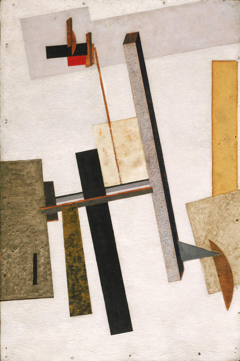
Circa 1919–20, Lissitzky coined the term Proun (pronounced pro-oon), pro-oon), an acronym for “PROyect Utverzhdenia Novogo,” which translates as “Project for the Affirmation of the New”… though some art historians interpret it as a contraction of “PROekt UNOVISa” (“Project of [Malevich and Lissitzky’s’s] UNOVIS art group”). He used the term “Proun” as a title for a series of abstract works combining the Suprematist lexicon of geometric, monochromatic forms with (proto-Constructivist) tools of architectural rendering.
Regarding Lissitzky’s “Proun” series, MoMA’s website tells us:
Lissitzky’s radical reconception of space and material is a metaphor for and visualization of the fundamental transformations in society that he thought would result from the Russian Revolution.
Unlike Malevich, Lissitzky wanted to explore the real wold and abstract geometry simultaneously — hence the notion, advanced by some art historians, that the “Proun” paintings served as a kind of bridge that allowed Suprematists to cross over into Constructivism. From the Guggenheim website:
Blurring the distinctions between real and abstract space — a zone that Lissitzky called the “interchange station between painting and architecture” — the Prouns dwell upon the formal examination of transparency, opacity, color, shape, line, and materiality, which Lissitzky ultimately extended into three-dimensional installations that transformed our experience of conventional, gravity-based space. Occasionally endowed with cryptic titles reflecting an interest in science and mathematics, these works seem engineered rather than drawn by hand — further evidence of the artist’s growing conviction that art was above all rational rather than intuitive or emotional.
It pains me to report that, by all accounts, the most harrowing departure from Suprematism for Malevich was that of Lissitzky.
KÉPARCHITEKTÚRA
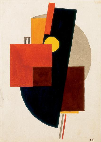
Kassák was a Hungarian writer, painter, and theoretician. In 1916 he founded Ma an avant-garde art and literary journal — which transitioned over time from Expressionist to Constructivist. The title, which means Today, is also an acronym for Magyar Aktivizmus (Hungarian Activism).
Influenced by Malevich and Tatlin, during his Constructivist period Kassák believed that the engineered exactness of straight and curved lines in non-objective art could prefigure a new, collective modern civilization and culture — i.e., breaking away from bourgeois artistic traditions. Which explains why he also believed that building an absolute, harmonious picture was a “constructive good deed.” In his paintings and prints under the “Képarchitektúra” banner, he balanced squares, rectangles, and circles to generate spatial energy… without mimicking real buildings. The idea is to create an image that will alienate viewers from their bourgeois context and compel them to work towards a new, egalitarian society.
From the manifesto “Képarchitektúra,” in the March 5, 1922 issue of Ma (March 25,1922):
Képarchitektúra is the enemy of all art, because only from it can art set forth.
Képarchitektúra is 2 x 2 = 4.
Képarchitektúra has killed mawkish zigzags and idyllic variety.
Képarchitektúra sees an endless spiral even in a straight line.
Képarchitektúra professes itself to be the human zenith.
Képarchitektúra does not wish to die on the wall.
Képarchitektúra wishes to be a town of American caliber, a look-out tower, a sanatorium for consumptives and a popular entertainment.
For Képarchitektúra is art, and art is creation and creation is everything.
Kassák wrote that Képarchitektúra “wants nothing” (meaning it completely empties art of past conventions) but at the same time “wants everything” (meaning it aims to rebuild and fully claim reality).
MECHANO-FACTURE

Berlewi (1894–1967) was a Polish-French Jewish painter, graphic designer and art theorist. In 1920 he attended El Lissitzky’s lecture in Warsaw, motivating him to move to Berlin, where in 1922–23 he abandoned figurative art for pure constructivist abstraction. In 1923 he presented his first Mechano-Faktura composition.
Inspired by Russian Constructivist ideas about faktura (the physical and material properties of a surface), Berlewi’s Mechano-Faktura compositions (like this one) eschew traditional three-dimensional illusionism in painting in favor of flat, rhythmic, two-dimensional geometric planes intended to replicate industrial texture. They artists deploys a systematic, “mechanical” approach to arranging basic geometric forms. And compositions are limited to the colors black, white, and red. All of this was a utopian visual metaphor for a new world that would have no room for hidden agendas, ornamentation, or institutional deceit.
By producing art works via an objective system rather than subjective emotion, the idea was to make it possible for factory workers, say, or machine operators to make and engage with art, breaking down the barrier between elitist “high art” and everyday labor.
Z II
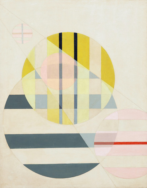
Moholy-Nagy was hired as an instructor by the Bahaus school in 1923. He wore overalls and no-nonsense spectacles; projecting what Frank Whitford’s book on the Bauhaus suggests was “an image of sobriety and calculation belonging to a man mistrustful of the emotions, more at home among machines than human beings.” Like his fellow Constructivists, he was “scornful of the idea of the artist as the inspired maker of unique objects indelibly stamped by his personality.”
He fetishized the machine. “To be a user of machines is to be of the spirit of this century,” he wrote in 1922. There was a utopian aspect to this perspective: “Everyone is equal before the machine. I can use it, so can you.”
Z II (1925) captures the artist’s transition from traditional pigment-based painting to an exploration of light, transparency, and modern technology… and the Bauhaus’s late-period Constructivist ethos — for which abstract, machine-age art was a tool for social renewal and a new, rational world.
The composition features floating geometric shapes (circles, lines, structural grids) that appear layered and translucent. They appear to slide past one another across illusory spatial planes, creating a sense of weightless suspension rather than flat, static geometry. Muted background elements or gridlines appear to shift in visual weight and become bolder when overlaid on top of solid or semi-transparent shapes.
From MoMA’s website:
In these years Moholy-Nagy also experimented with photography — a medium closely aligned with the credo of the Bauhaus: “Art and Technology: A New Unity.” These photographic investigations informed his painting process, which he reimagined as an art not of pigment but of light. This kind of cross-medium exploration was strongly encouraged at the Bauhaus, where a broad range of workshops in the fine and applied arts helped to shape productive relationships among faculty and students working in diverse media.
Experimentalist photography, mechanical media — the optics of light exposure, negative space, and overlapping transparencies — are reimagined via paint on canvas. Moholy-Nagy championed photography, film, and camera-less “photograms” as a democratic visual language. In his book Painting, Photography, Film (1925), he predicts that future illiterates would be those who could handle neither the pen nor the camera.
CONSTRUCTIV—IMPRESSIV

Paul Klee, who’d begun teaching at Bauhaus in 1921, was deeply ambivalent and cautious when it came to Constructivism. While he was highly interested in its structural logic (he was nothing if not fascinated by structural theories of art) and incorporated its grids, spheres, triangles, and precise lines into some of his own work during his tenure at the Bauhaus, he rejected its strict, dogmatic, “purified” machine-age rationalism. He believed that pure Constructivism lacked vital energy, organic life, and poetic mystery. His pedagogical maxim at Baauhaus — “taking a line for a walk” — emphasized movement, intuition, playfulness, and spontaneity over any ort of rigid geometric rules. (Another Klee phrase, “Sancta Ratio Chaotica,” suggests a sacred geometry that does not exclude chance, intuition, playfulness, imagination.)
The title of Constructiv-impressiv points to Klee’s effort to bridge the rigid, mathematical, and structural engineering-ish aspects of Constructivism with the fluid light, atmosphere, and sensory perception of Impressionism. The painting’s geometric shapes that reference technical architectural blueprints, and which rely on a calculated, if unseen skeleton or grid, is a nod to Constructivism. The vibrant atmospheric palette of overlapping red and green tones, creating an organic sense of space, depth, and illumination, is anti-Constructivist.
Constructiv-impressiv is not an anti-anti-utopian, but rather an anti-anti-utopian work of art. See below for an example of this artwork (cropped) used to illustrate the cover of a sf novel — one that I consider a Radium Age proto-sf novel. And which is about a utopianist’s discovery that chance, intuition, playfulness, and imagination are crucial.

BAUHAUS STAIRWAY
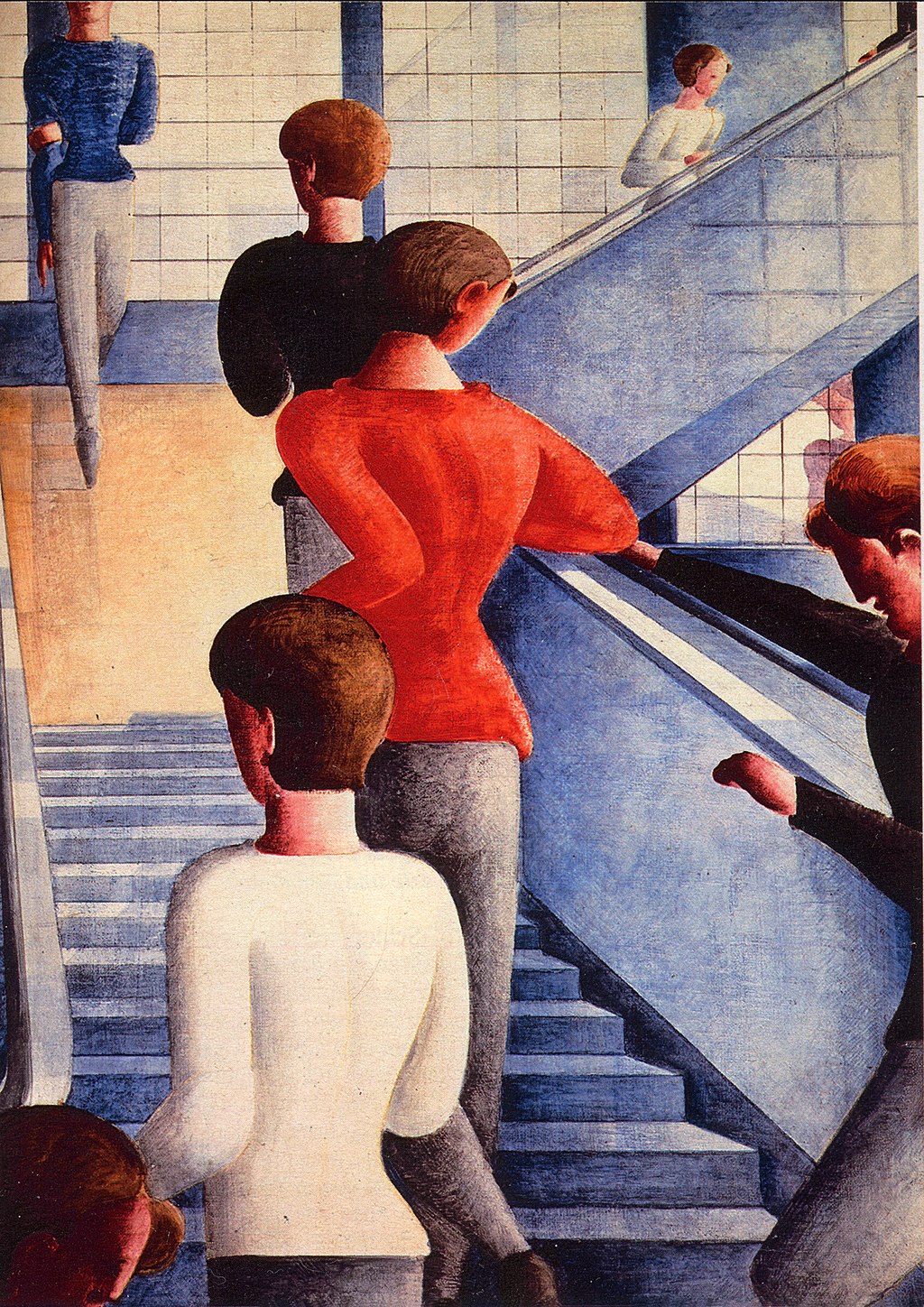
I find this quite a sad yet inspiring painting.
Schlemmer taught at the Bauhaus from 1921–29. The final, depressing years of the Bauhaus began in 1930, shortly after Schlemmer resigned. Three years later, the Nazi Party would the closure of the Bauhaus.
Painted just as the Dessau Bauhaus was forced to close under pressure from the Nazi-dominated local council, Bauhaus Stairway depicts Bauhaus students and teachers ascending the bright, geometric staircase of the school’s recently constructed Dessau building. The figures moving upward symbolize — or so art historians tend to agree — a rational, progressive modern society, and a rebuke to the authoritarian politics rising across Germany. The painting is both an elegy and a gesture of defiance.
After a Nazi critic labeled the painting “unfinished” (and Schlemmer’s art was officially labeled “degenerate” by the regime), the painting was hidden from public view. Schlemmer was banned from teaching; he’d spend his final years working in a paint factory. (He did during WWII.) After seeing the painting in an exhibition in Stuttgart, Alfred H. Barr, who’d become the first director of the Museum of Modern Art in 1929, persuaded Philip Johnson to buy it to save it from Nazi persecution. Johnson would later donate it to MoMA.
Josh Glenn’s EMANATIONS series includes the following installments: CATASTROPHE: DECLINE & FALL | DYING EARTH | ECO-CATASTROPHE. COSMIC AWE: DEEP TIME | STARS WHEEL IN PURPLE | IS THERE LIFE ON MARS. DEHUMANIZATION: CYBORG MANIFESTO | MECHANIZATION. & many others.
MORE RADIUM AGE SCI FI ON HILOBROW: RADIUM AGE SERIES from THE MIT PRESS: In-depth info on each book in the series; a sneak peek at what’s coming in the months ahead; the secret identity of the series’ advisory panel; and more. | RADIUM AGE: TIMELINE: Notes on proto-sf publications and related events from 1900–1935. | RADIUM AGE POETRY: Proto-sf and science-related poetry from 1900–1935. | RADIUM AGE ART: Proto-sf and science-related fine art from 1900–1935. | RADIUM AGE 100: A list (now somewhat outdated) of Josh’s 100 favorite proto-sf novels from the genre’s emergent Radium Age | SISTERS OF THE RADIUM AGE: A resource compiled by Lisa Yaszek.